Figma / Company website
Noctiluca Lighting Design
A lighting office's website
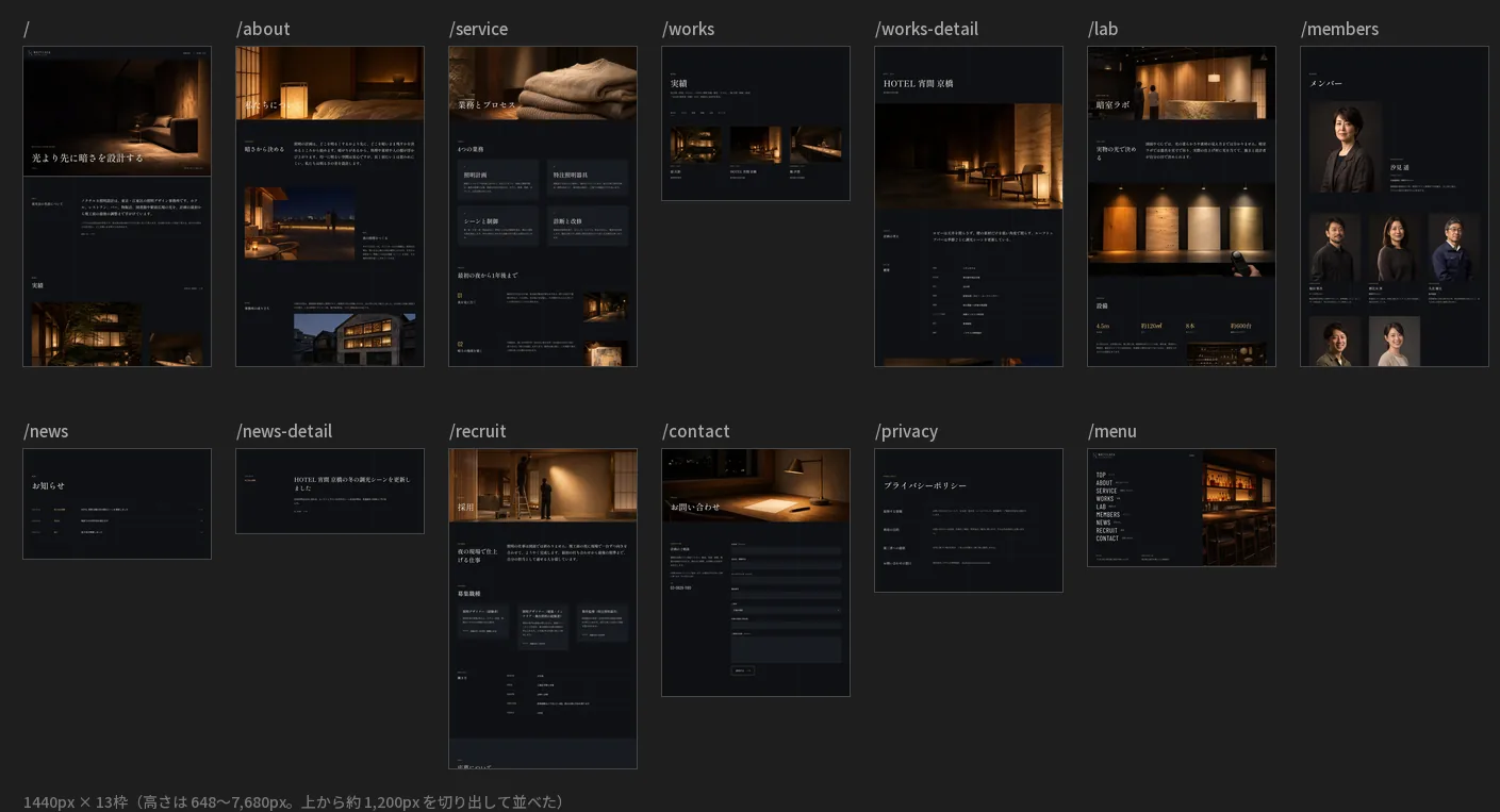
laid out in 13 frames.
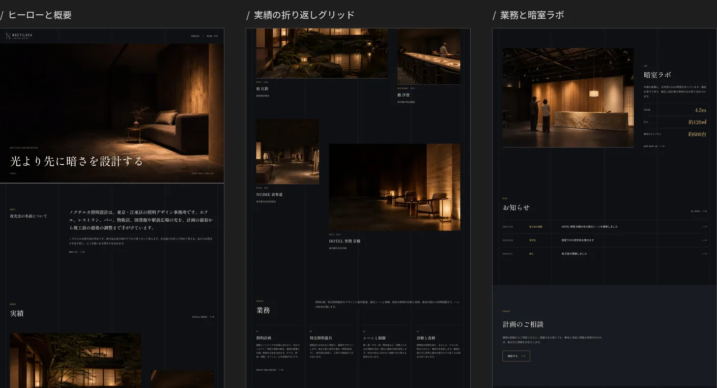
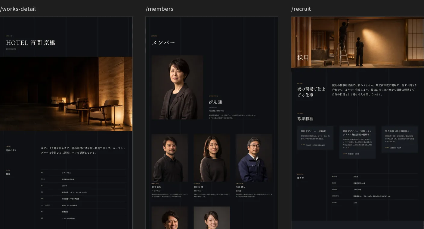
The Figma design file behind the company website of a lighting design office (Noctiluca Lighting Design, built in Studio). The 13 pages (home, about, services, works, a work detail, the dark-room lab, members, news, a news article, recruitment, contact, privacy and menu) are set side by side on one canvas as frames 1440 pixels wide. Six colours are fixed: an indigo-ink ground, washi-coloured text and a lantern-amber accent. Headings use a mincho typeface and the Latin labels a condensed one. The file was imported with Figma to Studio, and responsiveness, the CMS and motion were added on the Studio side. The notes below explain the aim and how it is put together.
This work is an original adaptation of a commissioned project. The Figma file is shared view-only and can be opened without signing in.
Built so it imports
into Studio.
This file is not a picture made to be looked at; it is the source data for a Studio import. A small test showed that Figma to Studio carries over nested layers, the direction, spacing and padding of Auto Layout, links, images and text values, while colour styles, text styles and components arrive empty.
So the file has no styles or components; colours and type are entered as plain values. The header, footer and consultation band are placed on the home frame only, then turned into components in Studio and placed on the other pages.
A frame's name
becomes the page's name.
The 13 frames are named as paths — "/", "/about", "/works-detail" — and spaced 1,600px apart. In the import's Multi-page Mode, each frame whose name starts with "/" becomes one Studio page. They are 1440 wide and 648 to 7,680px tall, and each is a vertical Auto Layout.
On import a frame's width becomes 100%, a fixed height stays in px, and the direction, spacing, padding and alignment of Auto Layout carry over as they are. For tablet and phone, Studio stacks horizontal rows and shrinks them automatically, and the details were then fixed in Studio.
Photos in the frame's fill,
text from data.
Photos are placed in a frame's background fill rather than in an image rectangle. An image rectangle is redrawn on import as a PNG twice the frame's size: a photo in a 432 × 267 frame became 864 × 534 and 487KB (the original JPEG is 156KB). The 28 photos are shrunk inside the plugin to JPEGs 640px wide (110–320KB), and the real photos were uploaded again in Studio.
The text was poured in from the fictional client's data (dummy-client.json) by a custom development plugin. 45 links between pages are set as Figma prototype links, and they become Studio page links on import. For the works list, only three sample CMS items are placed.
Exports turn white.
The stacking order flips.
The export used to shrink the photos (exportAsync) returned a white JPEG (about 8KB at 640 × 427) when an image had not finished loading. The first five passed and every one from the sixth was white, so the plugin now waits 0.5 seconds and exports again when a result is under 40KB. All 28 photos pass.
The vertical rules in the background are an absolutely positioned frame at the very back in Figma. After import, Studio draws an element that has a position above siblings that have none, so the rules appeared over the hero photo. Setting Studio's stacking order to -1 fixed it.
Project details
- Version
- 1.0.0
- Project type
- Fictional website
- Scope of work
- Design in Figma (laid out for a Studio import)
- Tools
- Figma, a custom development plugin and Figma to Studio
- Board size
- 13 frames, 1440 × 648–7,680px