Studio / Corporate website
Noctiluca Lighting Design
A light opens in the dark
projects grow from a table.
A company website for Noctiluca Lighting Design Inc., a fictional office in Koto, Tokyo, that designs lighting for hotels, restaurants, shops and public buildings. The desktop layout was built in Figma and brought into Studio (studio.design) with Studio's official Figma to Studio plugin. The mobile layout, CMS, animation, menu and contact form were then added in the Studio editor. There are pages about the office, its services, projects, its dark-room lab, members, news, careers and contact, and projects and news are shown from the CMS. All animation uses Studio's built-in features, with no custom code. The live screens and the editor screens are shown side by side. Contact messages are not sent.
Open the Studio site (Japanese)This work is an original adaptation of a commissioned project. Because the site is on Studio's free plan, a small Studio banner appears at the bottom left of the screen.
Layout decided in Figma
motion and updates in Studio.
For a lighting office, the site is a dark ground where only the light in the photos stands out. The 13 desktop screens were laid out in Figma, and Figma to Studio's multi-page import turned them into a 13-page Studio project in one go.
The rest was finished in the Studio editor. The header, footer and consultation banner became components placed on every page, projects and news moved into the CMS, and the animation, menu and form were added.
Animation uses only Studio's conditional styles (on appear, hover and scroll). Custom code is a paid-plan feature, so the site stays on the free plan in a form that people who do not read code can still edit in the editor.
Add one row
and the list and page grow.
The CMS has three models: projects (8), project categories (5) and news (6). Adding a project adds a card to the /works list and to its category page, and creates an item page at /works/[slug]. A new news post goes to the top of /news and of the list on the homepage.
The editor is where the text and photos on the fixed pages are changed, along with the four project cards on the homepage. Those four differ in size and position, so instead of a CMS list they are separate cards, each linked to its project page.
Studio's free plan allows up to three CMS models and 100 published items. This project uses three models and 19 items.
Four screen widths
four arrangements.
Studio starts with three widths: the base desktop, tablet and mobile. Putting percentage widths on the base made columns too wide on large screens, so a Small breakpoint was added and the percentages were set there only. The published site switches at four widths: 540px and below, 541–840px, 841–1140px and 1141px and up.
The hero is 85% of the screen height so that the title fits in the first screen on laptops and phones. Japanese headings break between phrases, and the main phone, tablet and desktop widths were checked for words split mid-line and for horizontal overflow.
Consistent titles
headings in order.
Page titles take the form of the page name followed by the office name. Item pages for projects, categories and news build their title and description from CMS fields. Studio text is a paragraph (p) by default, so the title on each page was changed to h1 and section headings to h2 and h3.
Before upload, the 49 photos were resized to JPEGs 1536px wide (member portraits are 900×1125). As a portfolio piece, every page has noindex and the site is published on Studio's free URL.
Project details
- Version
- 1.0.0
- Project type
- Fictional website
- Scope of work
- Design in Figma and build in Studio
- Tools
- Figma / Figma to Studio
Studio / Studio CMS - Pages
- 10 fixed pages, 3 dynamic pages (8 projects, 5 categories, 6 news posts), 2 modals
- Breakpoints
- 540px and below / 541–840px / 841–1140px / 1141px and up
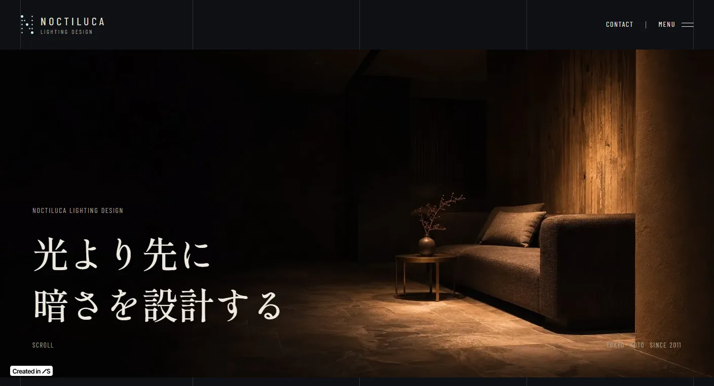
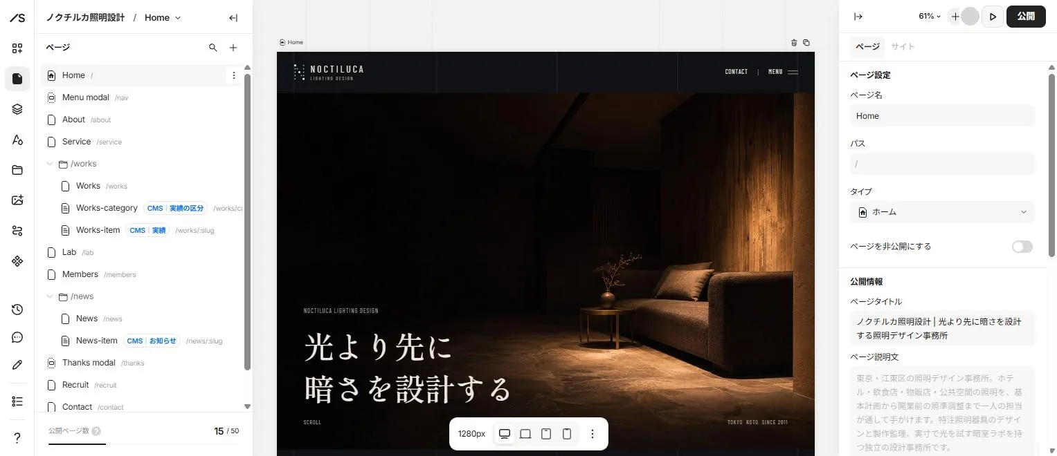
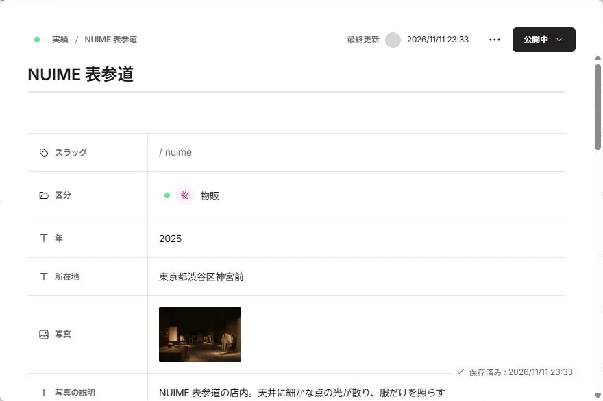
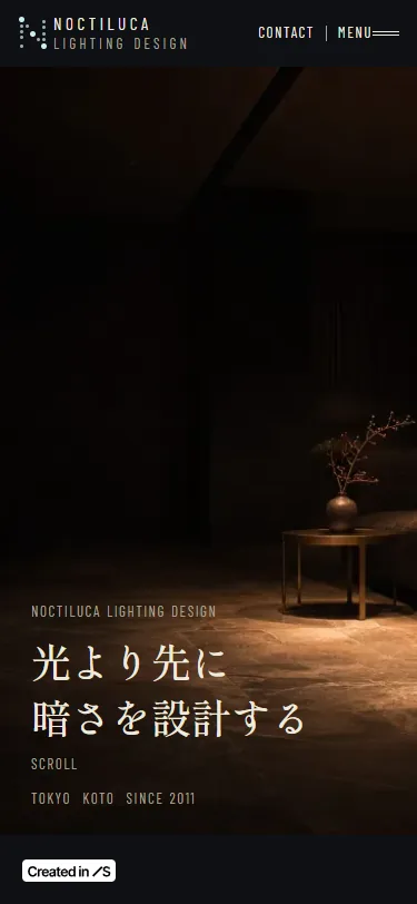
The live site
beside the editor.
Eight main features, each shown with the live site beside the Studio editor or dashboard.
-
01A homepage that lights up
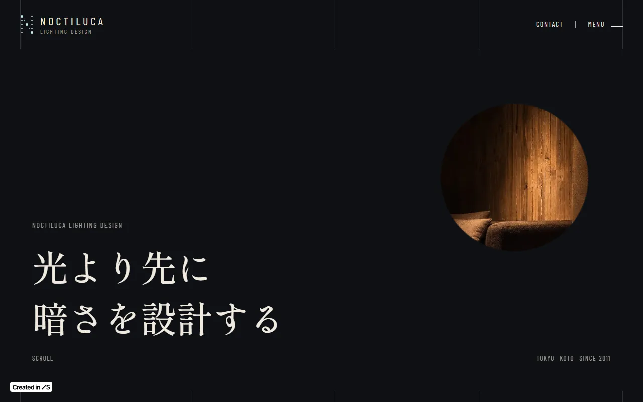
When the page opens, a small round light appears on a dark screen and spreads over the whole photo in 2.4 seconds. Studio's gradients are linear only and cannot make a round curtain, so a 200px circle carries a huge outer shadow (spread 3000) in the background color to act as the curtain. Its normal state is scaled to 3000%, and the on-appear conditional style takes it to 100%.
The circle sits in the middle of a frame sized in percentages, and its position changes with the width: on desktop the light opens on the glowing amber wall, on tablet and mobile above the vase and table. Studio's on-appear animations still run when a device is set to reduce motion.
Live site 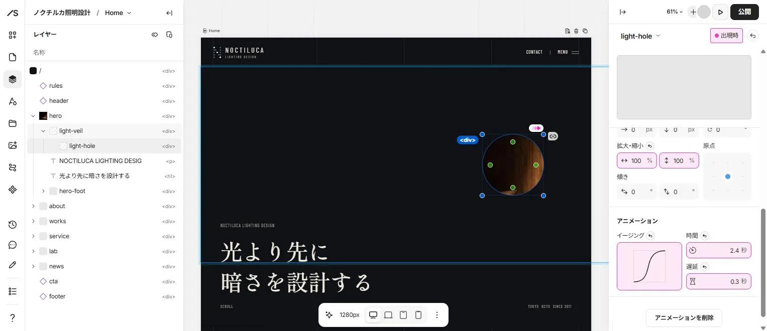
Editor -
02Project photos that light up on scroll
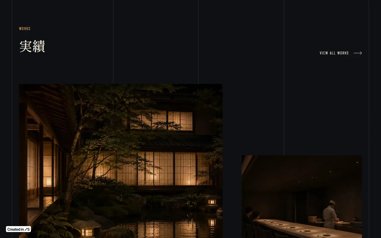
The project photos on the homepage are dark as they enter from the bottom of the screen and return to full brightness as the page scrolls. In the scroll conditional style the timeline is set to View, with a brightness filter of 25% at 0% and no filter at 100%.
On hover, a photo scales to 103% over 0.6 seconds, clipped to its frame. Sections and text rise 12px over 0.8 seconds as they come into view.
Live site 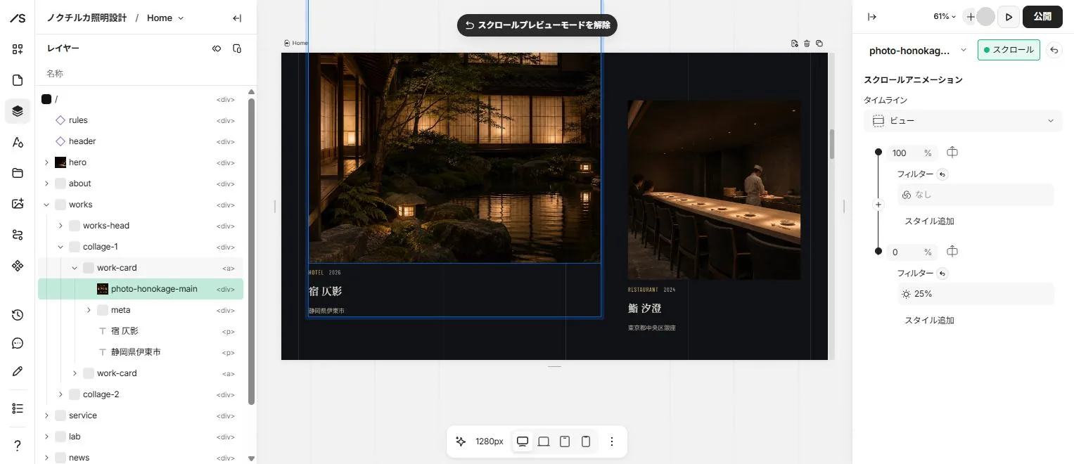
Editor -
03Projects
Projects are the eight items in the CMS model for projects, each with fields for category, year, location, four photos and their descriptions, the design thinking, and use and scale. The /works list follows the sort order field from smallest to largest, and clicking a card opens the dynamic item page at /works/[slug].
Categories come from a separate model for project categories (hotels, restaurants, retail, public and offices). The tabs at the top lead to /works/category/[category], where the list's Dynamic filter shows only that category's projects. The alt text for CMS photos is connected to the photo description field.
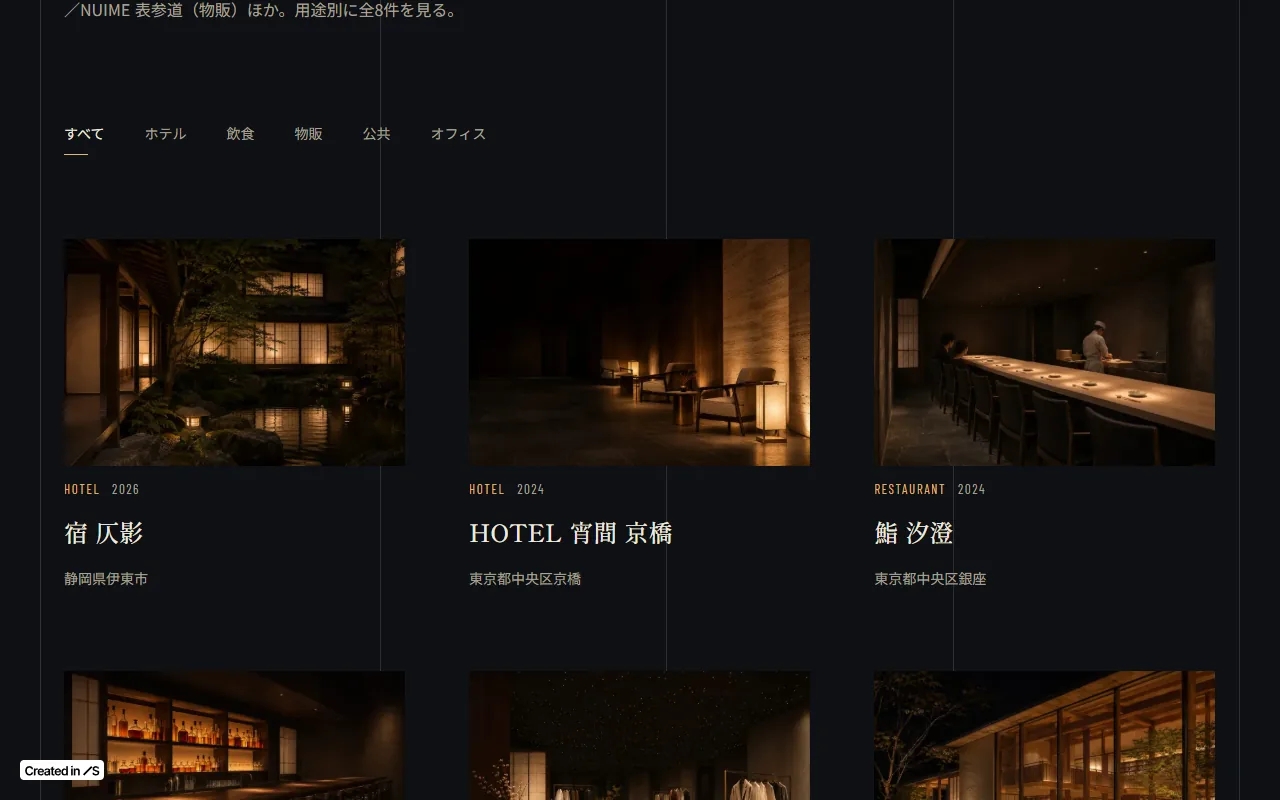
Live site 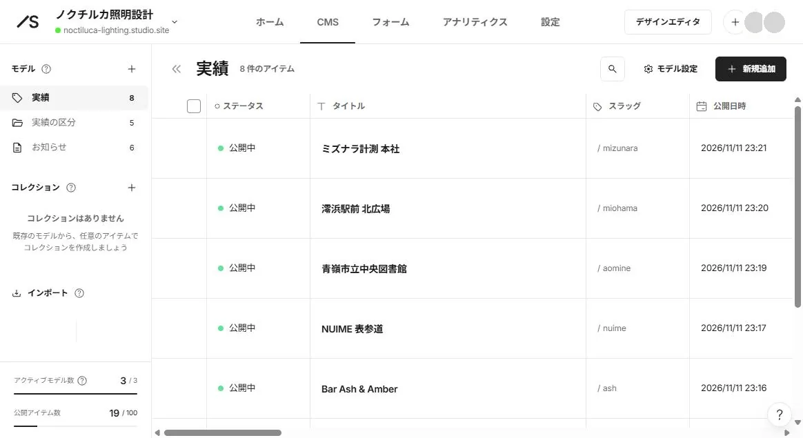
Dashboard (CMS) -
04News
News uses an article-type model with a title, a rich-text body, a date and a category. /news lists six posts by newest publish date, the homepage shows the newest three, and clicking a row opens the item page at /news/[slug].
Writing and publishing a post in the dashboard puts it at the top of both lists. There is no need to open the editor.
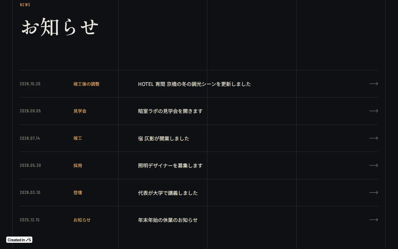
Live site 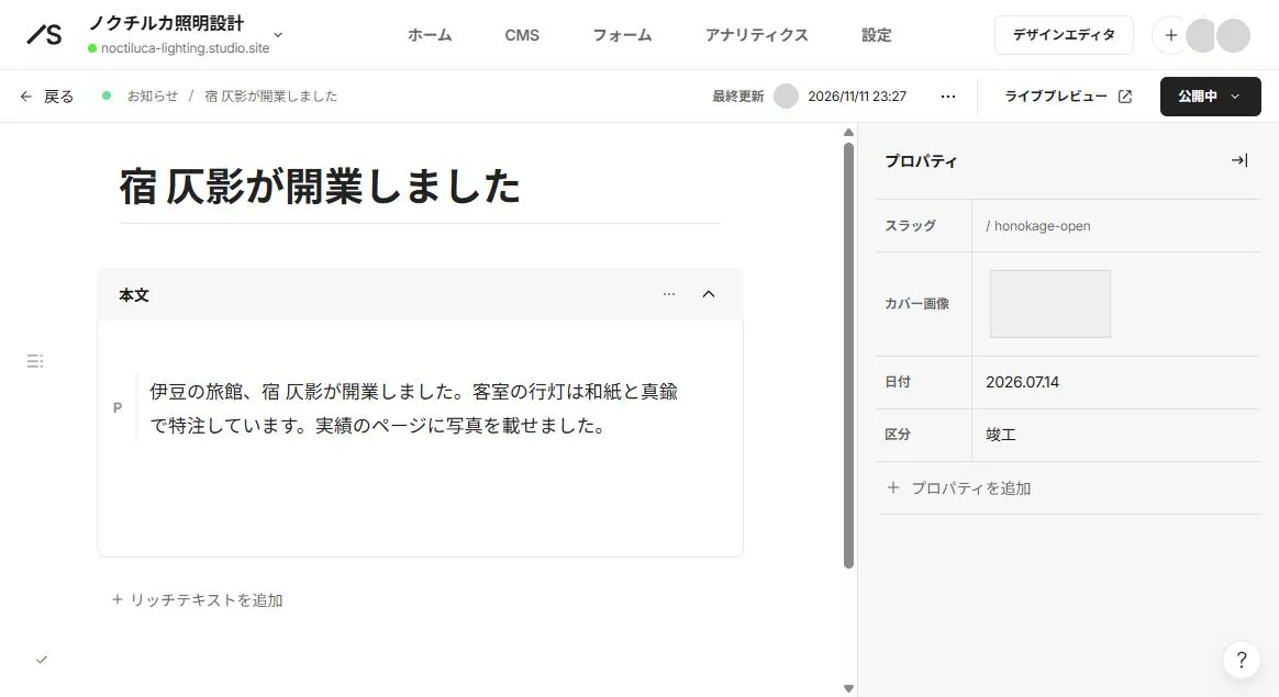
Dashboard (CMS) -
05Menu
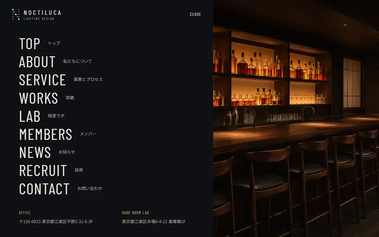
MENU in the header opens a menu built as a page of the modal type. A modal sits on top of the current page, so closing it returns to where the visitor was. MENU links to Menu modal and CLOSE is set to close the modal, and both become buttons (button). Esc also closes it.
The header is a component, so a link set in one place works on every page. On short screens only the inside of the menu scrolls, down to the addresses.
Live site 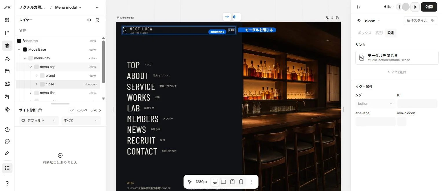
Editor -
06Contact
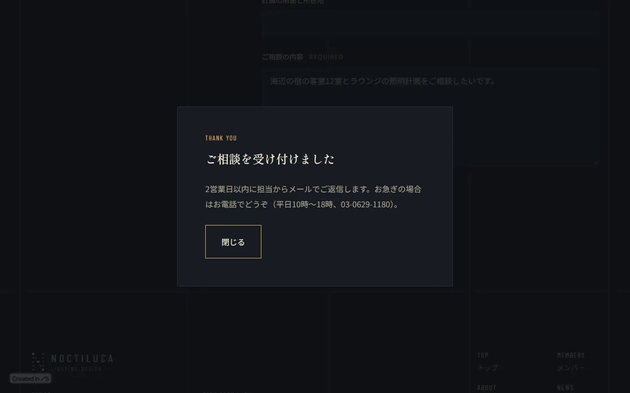
The form is built from Studio's form elements with seven fields (name, company, email, phone, subject, the project's use and location, and the message), and visitors can type in it. As a portfolio piece it has no submit button: the send box links to the Thanks modal, which shows the completion message without sending anything.
For a real site, replacing it with a submit button sends responses to the form list in the dashboard. On the free plan, up to 100 responses can be viewed.
Live site 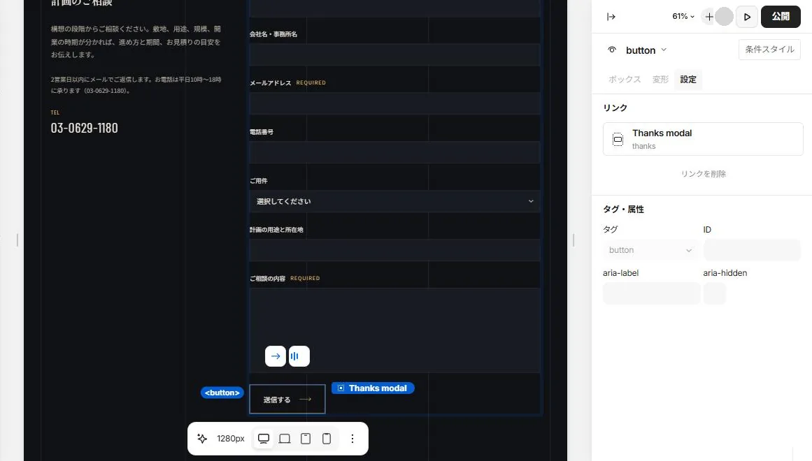
Editor -
07Mobile layout
Switching the width in the bar at the bottom of the editor lets values be set for that width only, and changed fields turn orange. On mobile, the news rows wrap: the date and category on the first line and the title on the second. The arrow on the right is hidden on mobile only.
Rows imported with Figma to Studio carried overrides on tablet, such as 100% widths on child elements, so they were removed one by one and the arrangement was set again. The width ranges shown in the editor (mobile 361–690px and so on) differ from the widths at which the published site switches (540px and below and so on).
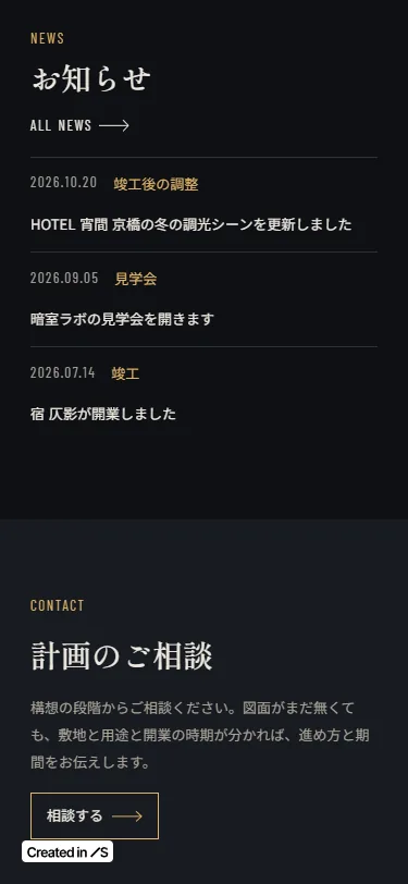
Live site 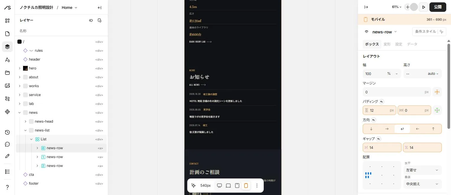
Editor (540px wide) -
08Publishing settings
Each page's settings hold its title, description, social cover image, language and noindex. Project pages take their title from the CMS title field, their description from the design thinking field and their social cover from the photo field.
As a portfolio piece, all 13 pages have noindex (the two modals have no such setting). For a real site, turning it off makes the pages searchable. To keep the Studio banner at the bottom left clear of text, extra space was added below the footer and menu on mobile and tablet.
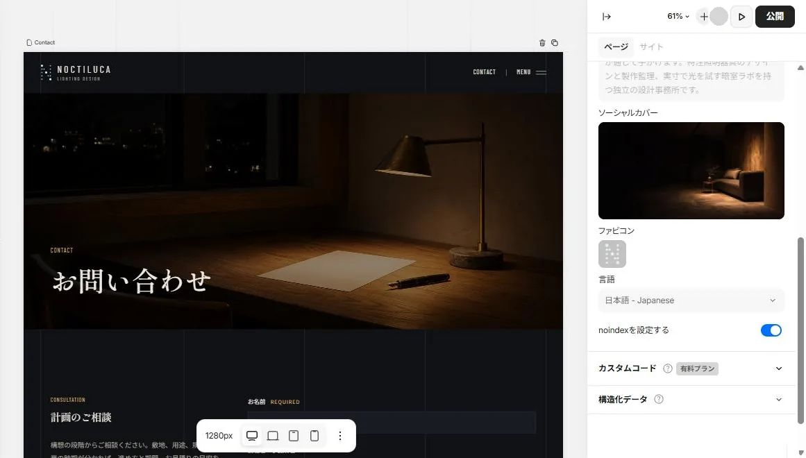
Editor (page settings)