Websites / Senior care search & move-in consultations
Sonaebiyori
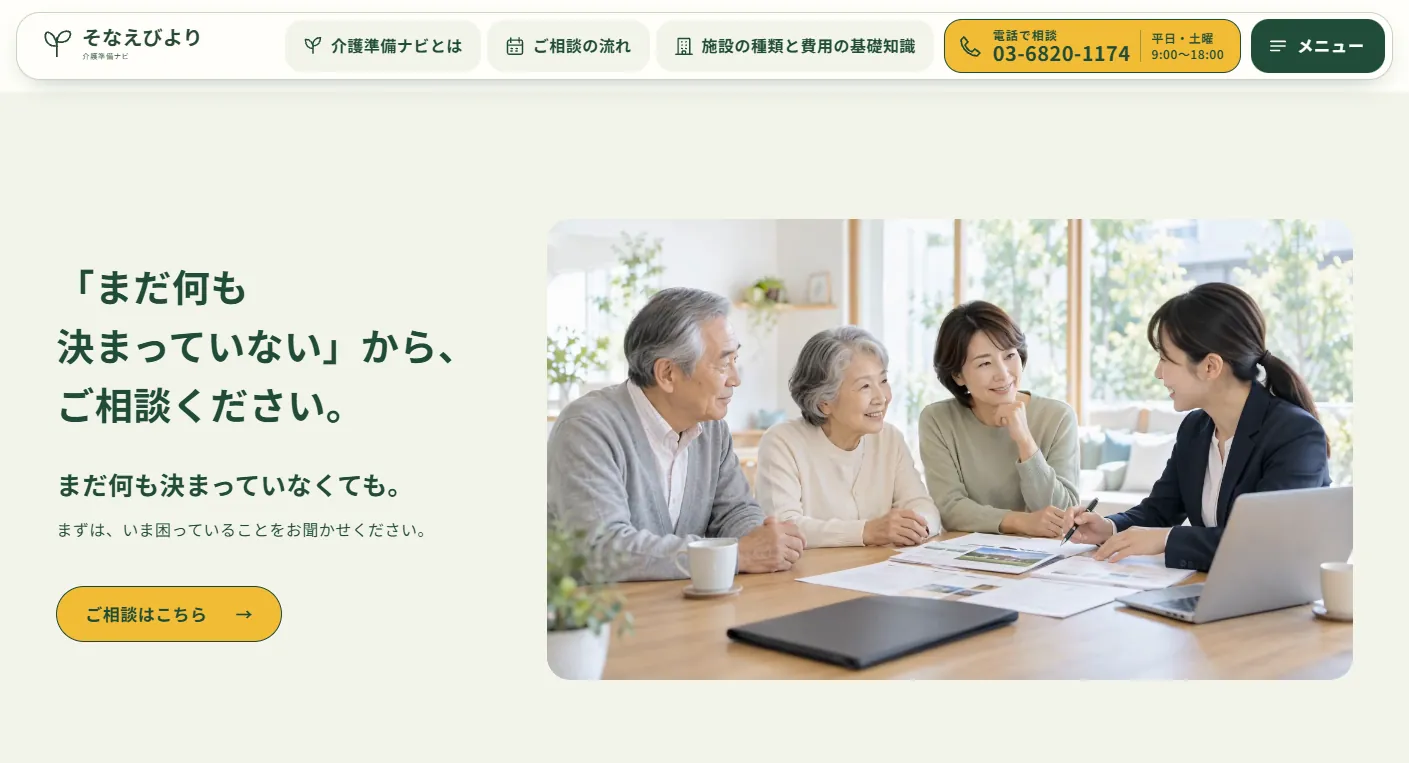
Help before you know where to start.
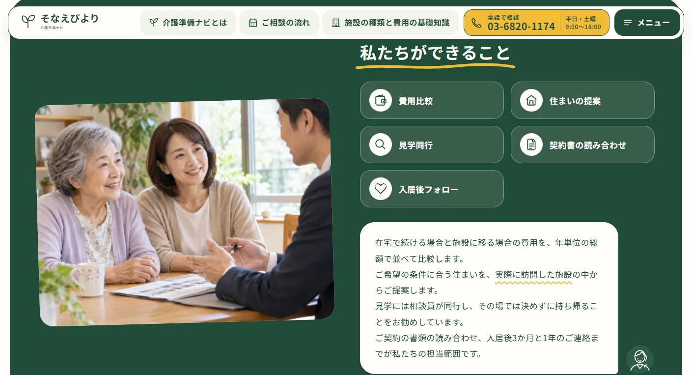
A website for a fictional company helping families find senior care facilities. It introduces the scope of support, how to read costs and the people providing advice, guiding families from their first questions to an inquiry.
View the live projectThis work is an original adaptation of a commissioned project.
Room to decide without pressure.
The intended audience is adult children beginning to worry about parents who live elsewhere. The page covers common stages of concern, what the service does, what it deliberately avoids and how costs work. Families get the information they need before being offered a facility.
Homepage footage advances with scrolling, moving from discussing preferences to comparing costs and accompanying a visit. Short text changes with each scene to explain the consultation process step by step.
Conversations shown through bubbles and notes.
Large rounded areas in pale and deep green sit over a warm ivory background, with large, bold sans-serif headings. One rounded header card groups generously sized navigation buttons with a persistent phone consultation button. Yellow highlights the consultation and phone actions.
Speech bubbles for families and advisers include hand-drawn portraits. Key points appear on slightly tilted sticky notes, while lists use rounded cards. Hand-drawn yellow lines underline headings, circles draw around key phrases as they enter view, and sticky notes float down into place.
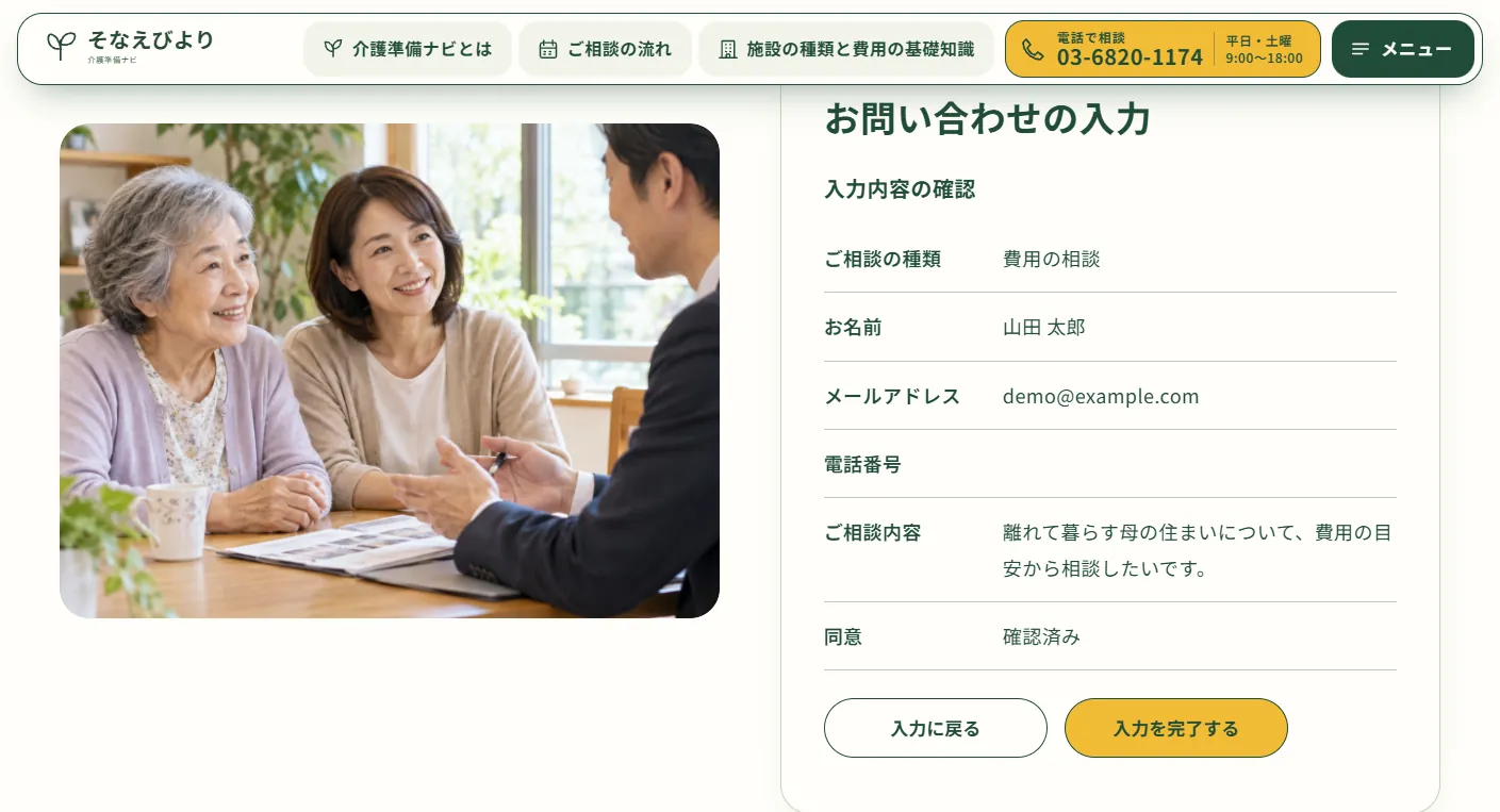
Review an inquiry before completing it.
After visitors enter a consultation type, name, contact details and message, a review list opens on the same screen. They can return to editing or proceed without leaving the page.
Facility types are grouped in expandable sections so visitors open only what they need. This demo does not submit inquiries, send emails or refer visitors to facilities.
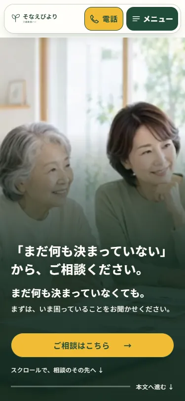
Full-screen footage with text below.
On mobile, footage fills the area from the header to the bottom of the screen, with framing adjusted for each scene to keep people in view. White headings and a consultation button sit over a deep-green gradient at the bottom, alongside a link to the page content. The logo, phone and menu share one header card, keeping the phone action visible on every page.
Project details
- Version
- 1.0.0
- Project type
- Fictional business
- Scope of work
- Structure, copy, design & development
- Technologies
- HTML / CSS / JavaScript
Vite / GSAP - Supported screen sizes
- Desktop, tablet & mobile