Web Apps / Hair & beauty salon booking
Salons Up
That seat
is available now.
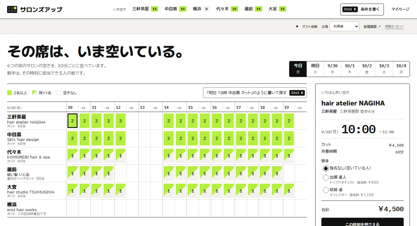
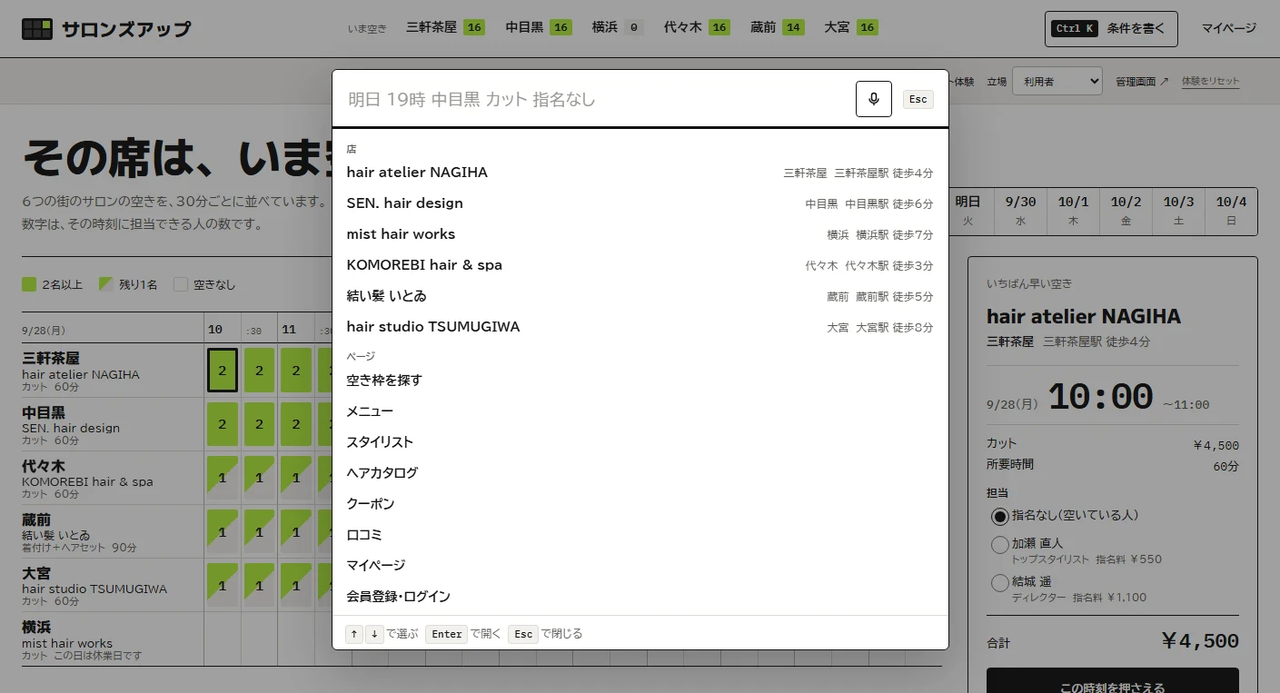
A hair and beauty salon booking portal for a fictional operator. Its homepage hero is an availability grid with salons as rows and times as columns. A Command+K palette finds openings from typed conditions in natural language. One demo covers booking confirmation, salon acceptance, and reviews of listings and customer feedback.
View the live projectThis work is an original adaptation of a commissioned project. Payments and notifications are simulated; no real charges or transfers take place.
Choose an opening
that fits your time.
The design assumes visitors already know when they want to go. The homepage grid has salons as rows and times as columns; each cell's number shows how many staff can take a booking at that time.
Selecting a cell opens a booking panel on the right and continues through payment. Switching between customer, salon staff and operator shows the same booking data through each role's interface.
White, ink and lime
highlight availability.
A white background and ink-colored text reserve lime accents for available slots. Headings use M PLUS 1, body text BIZ UDPGothic, and times and prices monospaced IBM Plex Mono for readable figures.
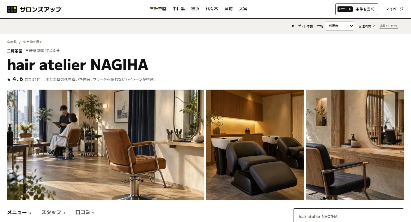
Salon details open with a full-width strip of three photos, followed by tabs for treatments, staff and reviews. Available slots always include a staff count so the display does not rely on color alone.
Type in Command+K.
The grid narrows down.
The Command+K (or Ctrl+K) palette interprets Japanese natural-language conditions as they are typed, such as a request for tomorrow at 19:00 in Nakameguro, a haircut and no preferred stylist. Matching shops, salons and pages appear, the grid uses the same filters, and the conditions remain in the URL.
The chosen slot moves into the right-hand panel with a temporary-hold bar and continues through payment. Switching roles lets visitors try the salon's booking ledger and client records, or operator reviews of listings and customer feedback. Payments and notifications are simulated, with no real transfers or emails.
Keep the grid readable
on smaller screens.
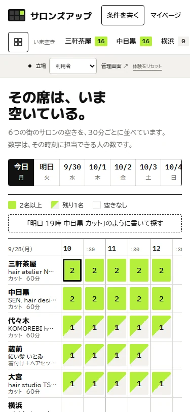
On mobile, the heading and explanation precede the grid, with search conditions stacked below them. Navigation collapses, while role switching remains at the top.
Project details
- Version
- 1.0.0
- Project type
- Fictional service
- Scope of work
- Planning, design, visual design & development
- Technologies
- TypeScript / Vite
Node.js / SQLite - Supported screen sizes
- Desktop, tablet & mobile