Figma / Crowdfunding landing page
Breeze Pillow
A crowdfunding page
rebuilt as a 1080-wide board.
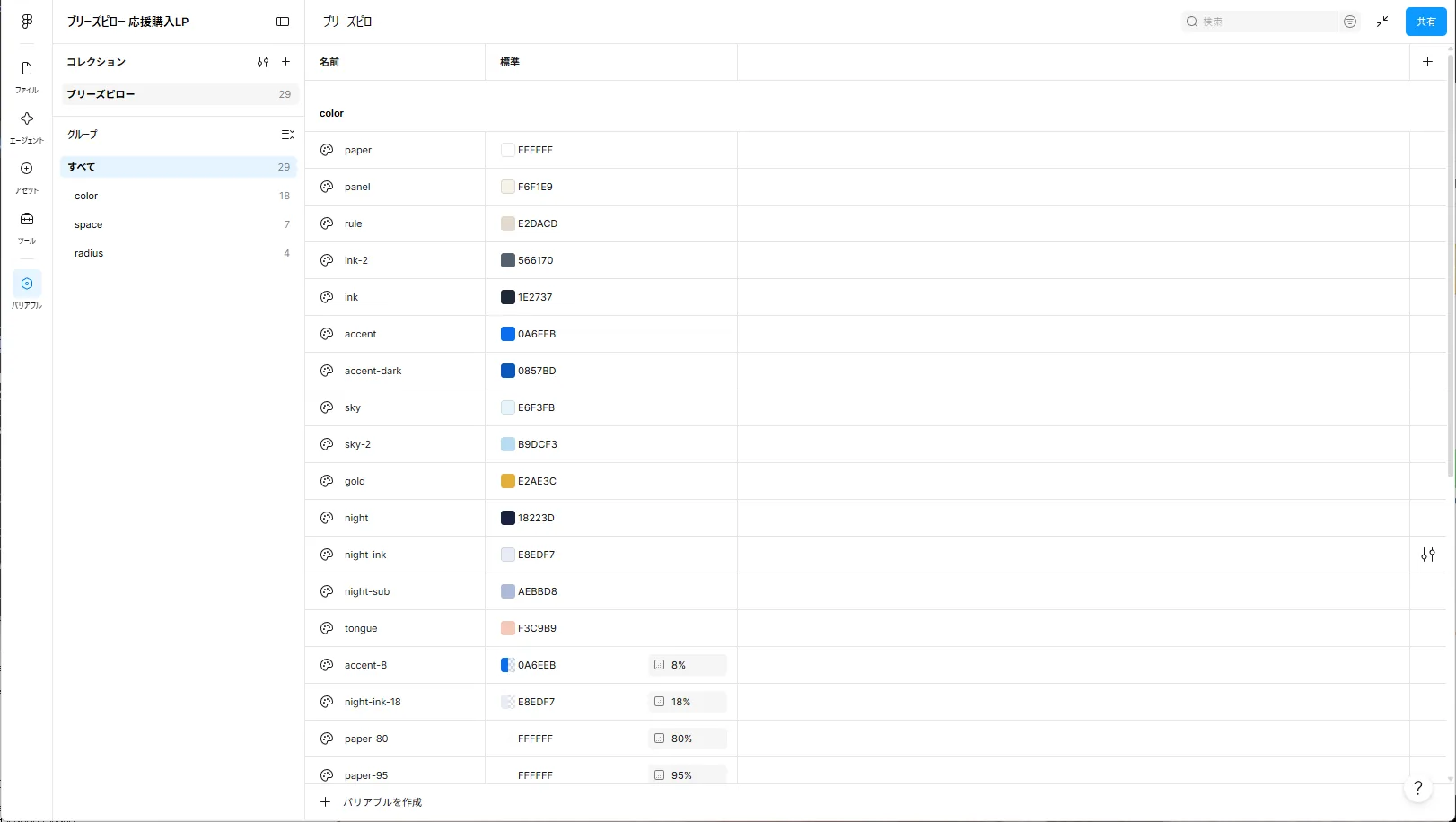
A Figma design file that rebuilds the Breeze Pillow crowdfunding landing page, originally built in code, as a tall board 1080 pixels wide. Crowdfunding pages are often made from 1080-wide images stacked vertically, so the board uses that width. Colours, spacing and corner radii are 29 variables, text uses 19 styles, and buttons, small headings and other parts are eight components. All 25 blocks and one photo band are built with Auto Layout. The five checkout screens were added too, so the board's buttons lead into a clickable prototype. The prototype and block-by-block notes below explain both.
This work is an original adaptation of a commissioned project. The Figma file is shared view-only and can be opened without signing in.
The design file and
the prototype side by side.
In the design file you can zoom and pan to look around the board. In the prototype, the board's buttons lead into the checkout screens. Both start at the top of the board.
The mobile layout
scaled by 2.77.
The mobile layout of the landing page, 390 pixels wide, was moved onto the board at 1080 ÷ 390, about 2.77 times. The desktop layout (1024 pixels and wider) exists only in the code.
At 2.77 times, the page's 10–12px notes and tags become 28–33px. So that the board stays readable even as a scaled-down image, every piece of text on it is at least 36px. No new words were added on the board.
Colour, spacing and type
chosen by name.
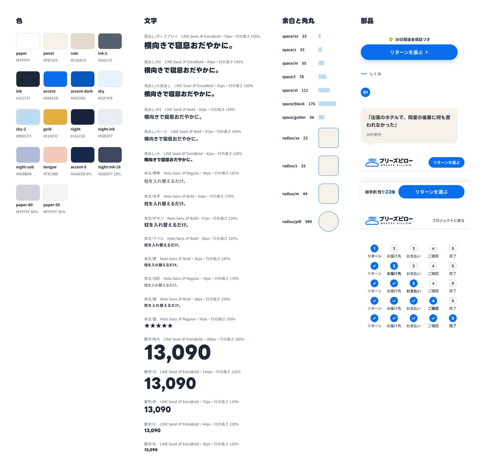
Fourteen colours, four translucent colours, seven spacing values and four corner radii make up 29 variables, and fills, strokes, spacing and radii are bound to them. Multiplying the page's spacing by 2.77 produced scattered odd values, so vertical spacing was snapped to six steps (22, 33, 55, 78, 111 and 176) and side margins to 56.
There are 19 text styles: six headings, eight body styles and five numeral styles. Headings and numerals use LINE Seed JP; body text uses Noto Sans JP. The page had more than a dozen numeral sizes between 13 and 128px; the board reduces them to five steps (36, 44, 72, 140 and 180), and every price, percentage and year uses one of them. There are five effect styles for shadows and blurs, and eight components: the button with its money-back line, the eyebrow label, the numbered pin, the monitor comment, the header and the bottom bar, plus the checkout header and the progress steps for the checkout screens. Their text is changed through component properties.
The fixed header and the bottom button on mobile belong to the screen rather than the page, so they sit on the Design foundations page instead of the board.
Built by a plugin
checked as a whole.
The variables, styles, components, the Design foundations page, all 25 blocks and the band were created with a custom development plugin. As on the landing page, the logos and icons are SVGs traced from drawings made with image generation, with their line and shadow colours bound to variables. Each block is a vertical Auto Layout frame, and the frames inside are Auto Layout too, except those that stack illustration parts. Animated illustrations on the page are drawn in the final pose they stop at when reduced motion is on.
After building, the board was audited: zero text under 36px, zero text without a style, zero solid fills not bound to a variable and zero frames without Auto Layout. The board's text was also exported and compared with the page, confirming that all 304 text layers appear on the landing page.
Fills bound to variables
ignore their opacity.
When a fill is bound to a variable, Figma draws it with the variable's colour opacity and ignores the opacity set on the fill. Where a translucent colour was needed, such as the white labels over photos or the borders in the night section, I created colour variables that carry the translucency (accent at 8%, night-ink at 18%, paper at 80% and 95%) and bound those.
Rebinding the fills of imported SVGs to variables also removed their translucency, so it was moved to the opacity of each shape.
Project details
- Version
- 1.1.0
- Project type
- Fictional business
- Scope of work
- Design in Figma (rebuilding the landing page)
- Tools
- Figma and a custom development plugin
- Board size
- 1080 × 60,139px (25 blocks and a band)
- Prototype
- Five checkout screens (1080 × 2338px), 16 connections
From the board's buttons
to five checkout screens.
On its own the board looked like little more than a set of component samples, so the landing page's five checkout screens (reward, delivery, payment, review and done) were added and connected to the board's buttons as a clickable prototype. Each screen is 1080 × 2338, the mobile 390 × 844 at 2.77 times, and clips its content so it scrolls vertically. The checkout header at the top and the total bar at the bottom of the reward screen stay fixed while the content scrolls.
As on the landing page, the board's View rewards button scrolls to the rewards in block 23 (0.8 seconds), and both Choose a reward buttons go to the reward screen. Forward buttons push the screen out to the left and back links return it to the right (0.3 seconds). Back to the project in the header and the button on the done screen dissolve back to the board. There are 16 connections.
The delivery fields, the chosen payment method and the review contents are drawn already filled in, so the prototype only moves forward and back. Two components were added, the checkout header and progress steps that switch the current step through five variants, and the button component gained a property that shows or hides its money-back line, which is hidden on the screens' forward buttons. The screens' text is also at least 36px and was checked against the landing page's checkout. The only differences are values the page calculates (prices, remaining stock, totals and the order number), the sample entries and line breaks added so words do not break mid-word.
Open the prototype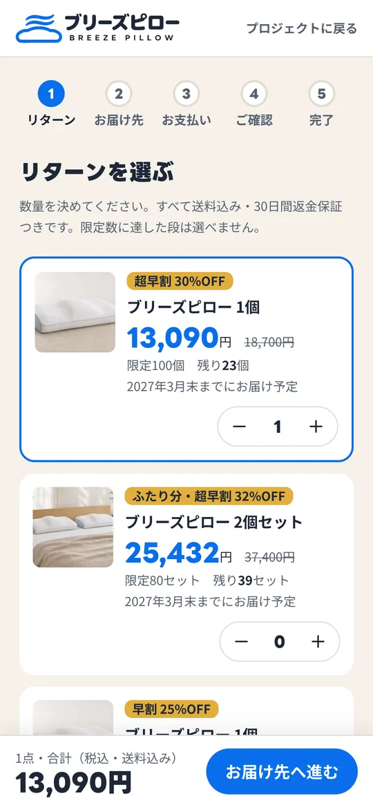
1Reward 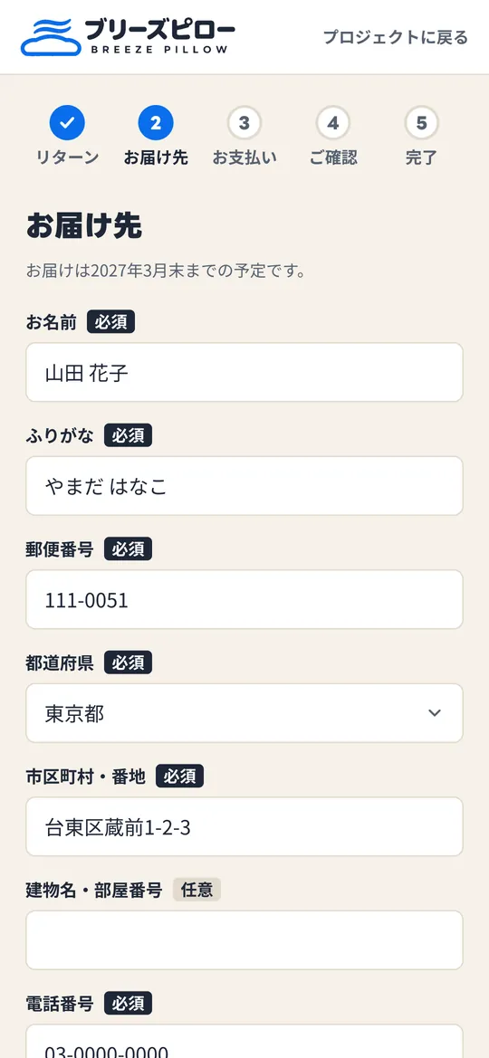
2Delivery 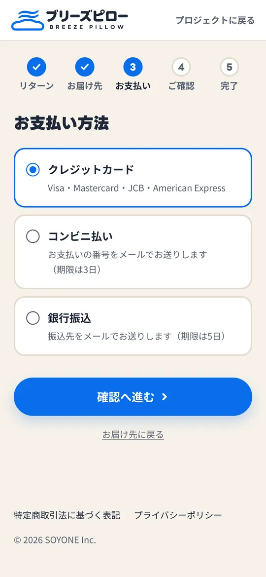
3Payment 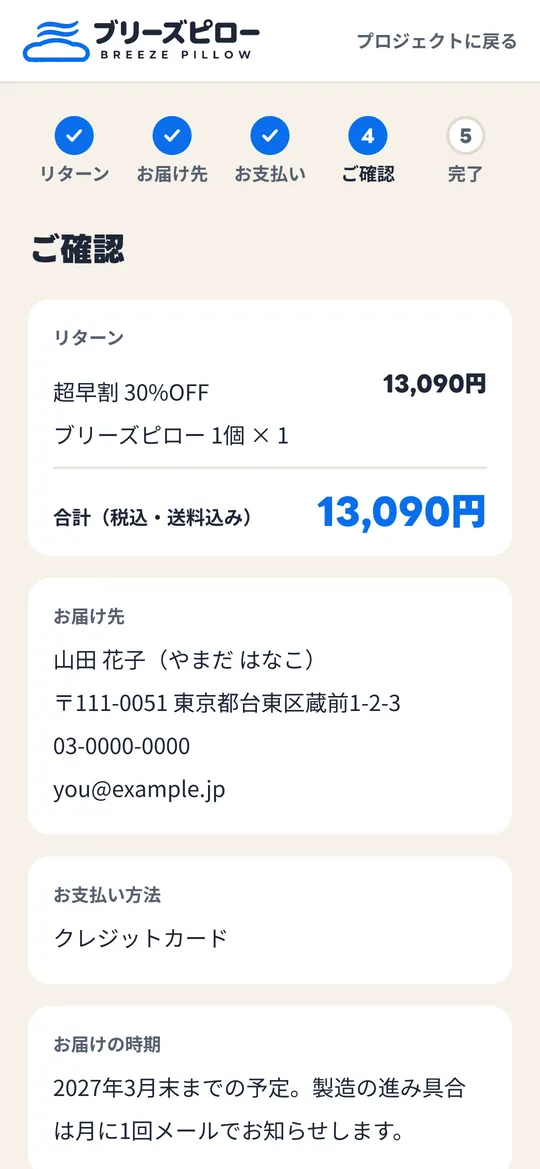
4Review 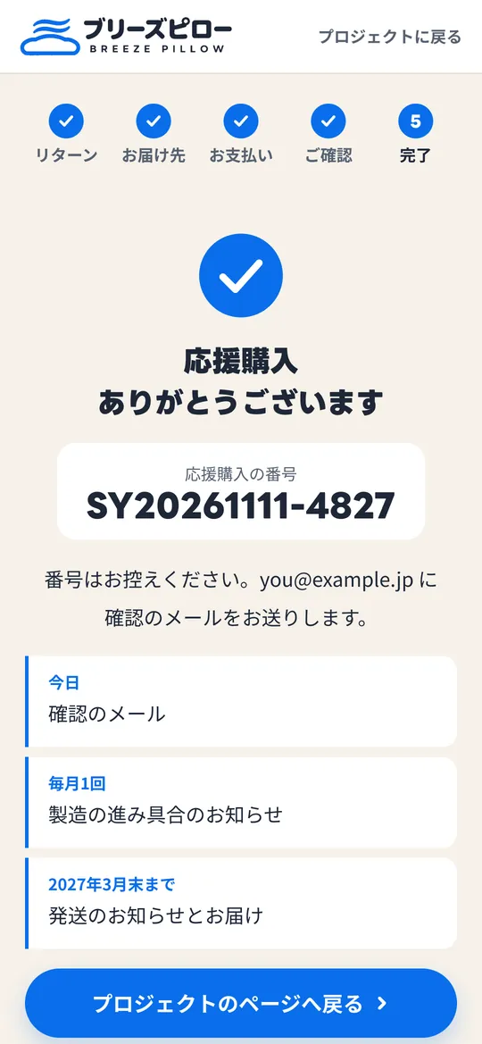
5Done
25 blocks
from top to bottom.
Each of the board's 25 blocks and the band, with how it was rebuilt from the original landing page (Japanese). The images are exported from the board and scaled down; the Figma file shows them at full size.
-
01Thumbnail
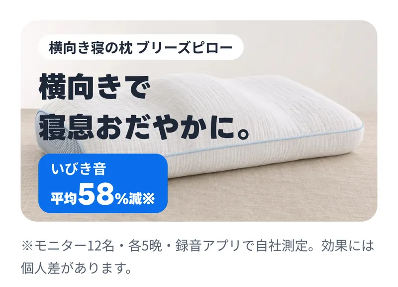
Because it appears as a small image in listings, the product photo card (radius m) carries a white product-name label, the title and the snoring figure. In the blue tag for snoring sound reduced by 58% on average, only 58 uses the medium numeral style and the rest uses the tag numeral style, so sizes change within a single text layer. The note is 36px too.
-
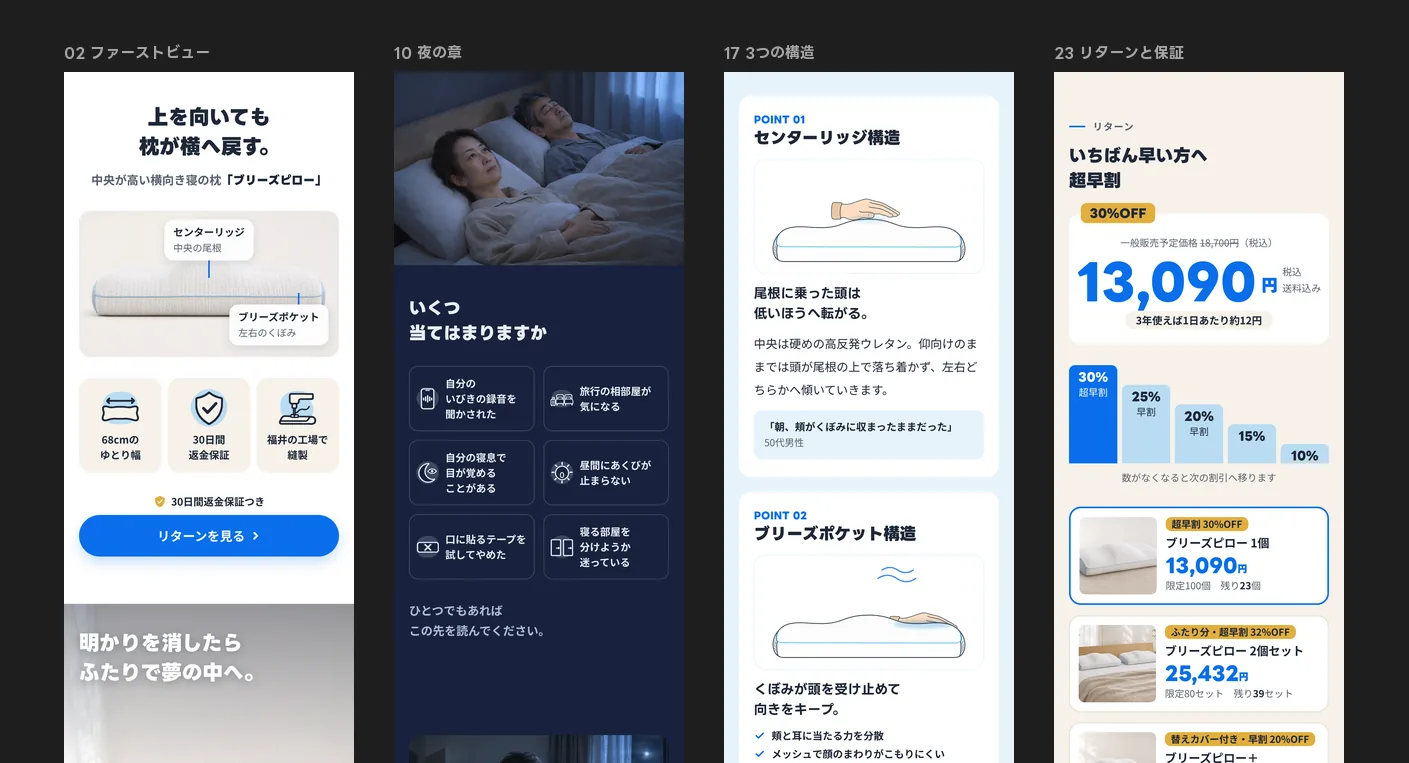
02First view
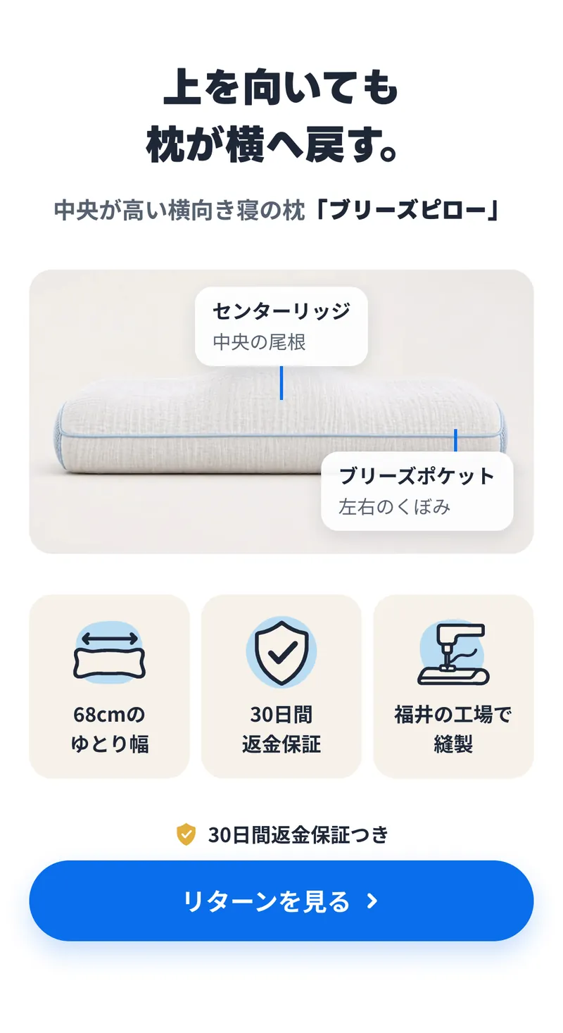
The heading is centred, and two callouts sit over the pillow photo. Their background is paper at 95% with the speech-bubble shadow, so the photo shows through slightly. The pointer lines are accent.
Below, three tags pair 144px icons with the label text style. The icons are the same SVGs as on the landing page, with lines bound to ink and shadows to sky-2. Last comes the button component with its money-back line, marked by a filled shield in gold. Its label is set through a component property.
-
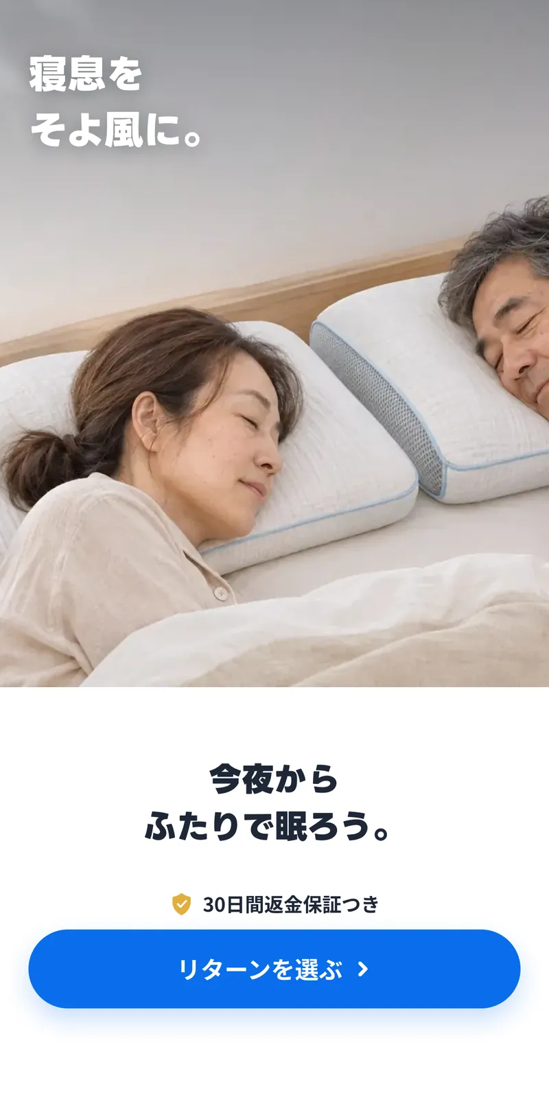
03Hero
A block with text over a photo. The photo and a gradient from ink at 40% to 0 are layered as the frame's fills, and the text is an Auto Layout child. The frame is fixed at 1350 high and does not shrink to its content. The text carries the text-on-photo shadow.
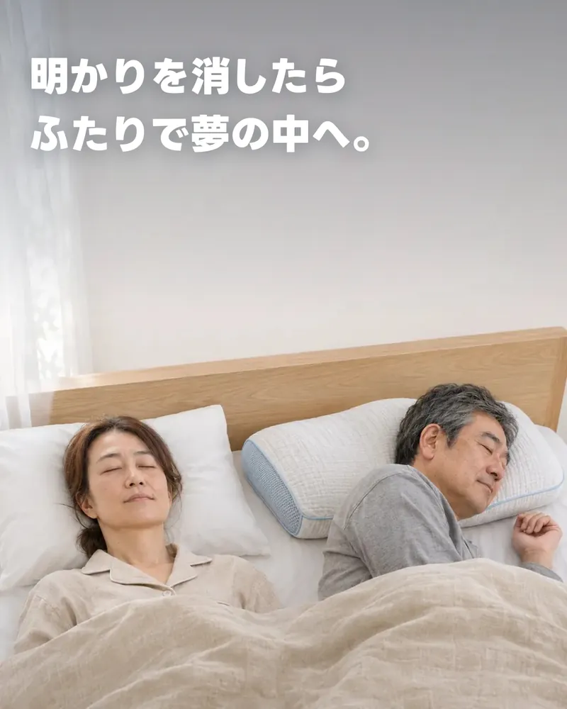
-
04Q&A
A gradient line from rule to accent links the question box to the answer. The question text, 19px on the page, uses the H3 style, and Q and A use the small heading style. The answer is a display heading, with only the word for direction in accent.
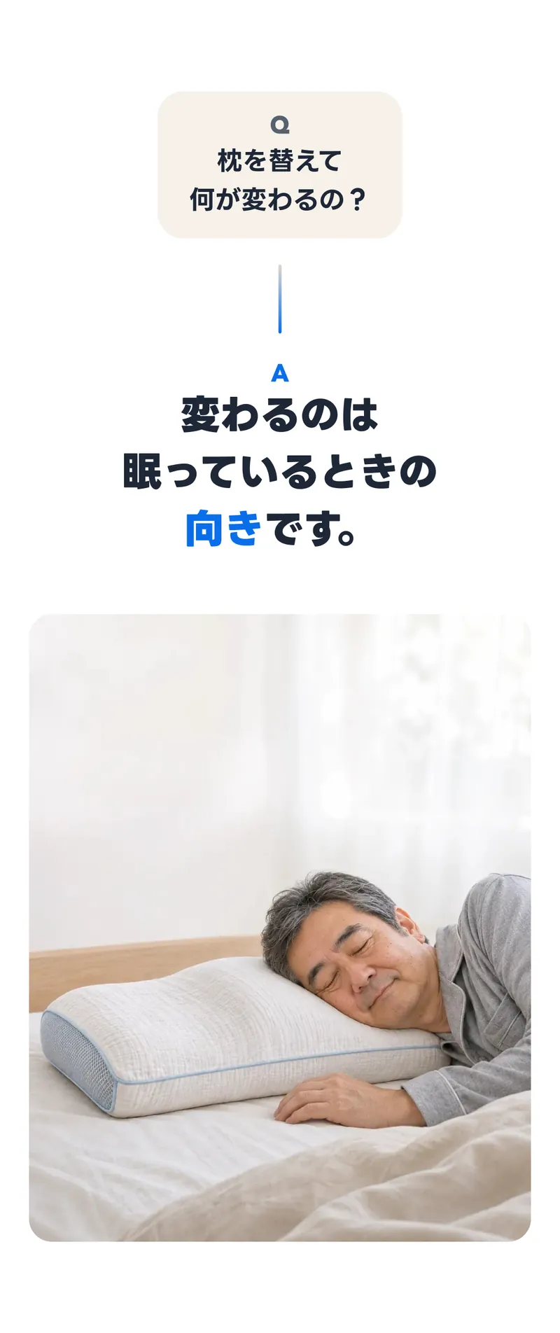
-
05How it works
On the page, the diagram's text sits inside the SVG. On the board, the text was moved out into Figma text and only the shapes were imported, so the labels can be edited later. Both diagram frames use a rule stroke and radius m, with a legend and a note below.
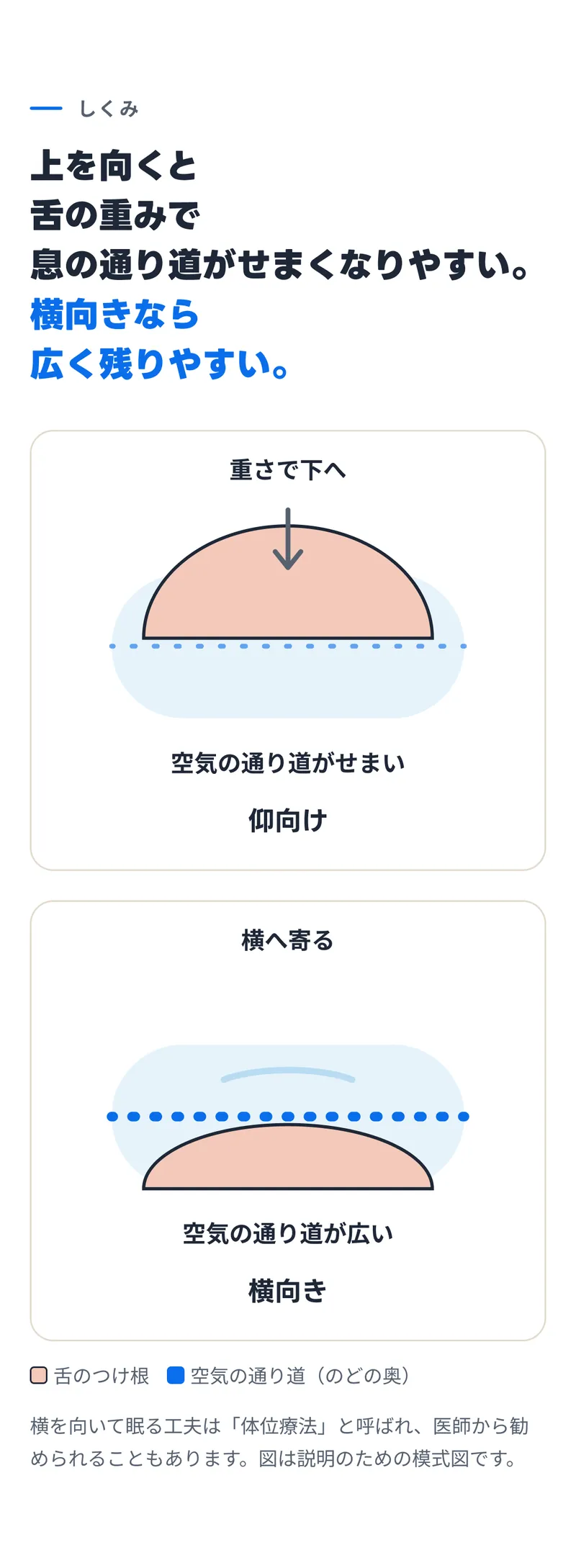
-
06Facing up by morning
One night's sleeping positions are drawn as rectangles placed side by side, one per interval. Their widths are calculated from the page's proportions (on the side or on the back, from 10 pm to 6 am). The bar is clipped with the pill radius, and about 4 nights out of 14 uses the large numeral style.
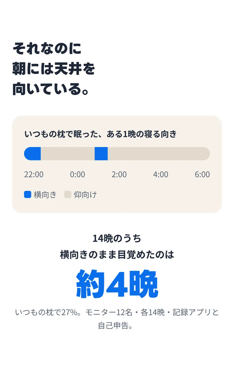
-
07The secret of the shape
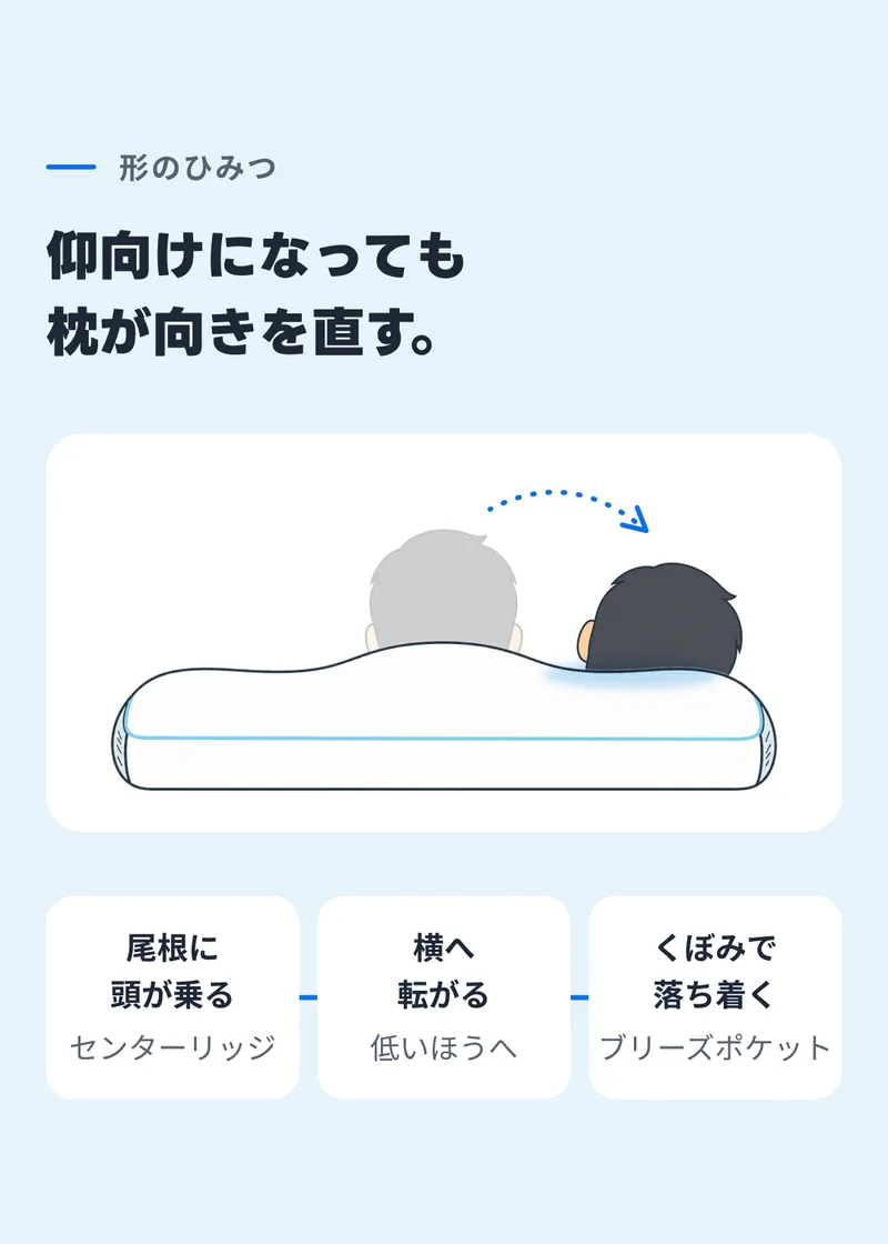
On the page, an animation shows the head rolling off the ridge. Since the board cannot move, the starting head is left faint and a dotted arrow shows which way it rolls. The labels for the three steps break onto two lines where the page wraps them.
-
08We measured it
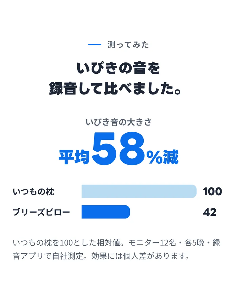
In the figure for 58% less on average, only 58 uses the extra-large numeral style and the rest uses medium. The bars compare the usual pillow at 100 with Breeze Pillow at 42, in sky-2 and accent. The name column is fixed at 288, and bar lengths are calculated as a proportion of the remaining width.
-
09Morning and day
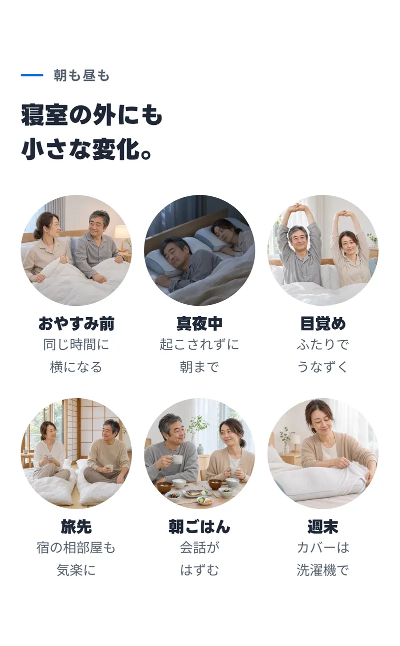
Six round photos (300 × 300, pill radius) sit three to a row in a wrapping Auto Layout. At 36px a caption line fits only eight Japanese characters, so each caption is broken into two lines at a word boundary.
-
BandFind the pillow that fits you
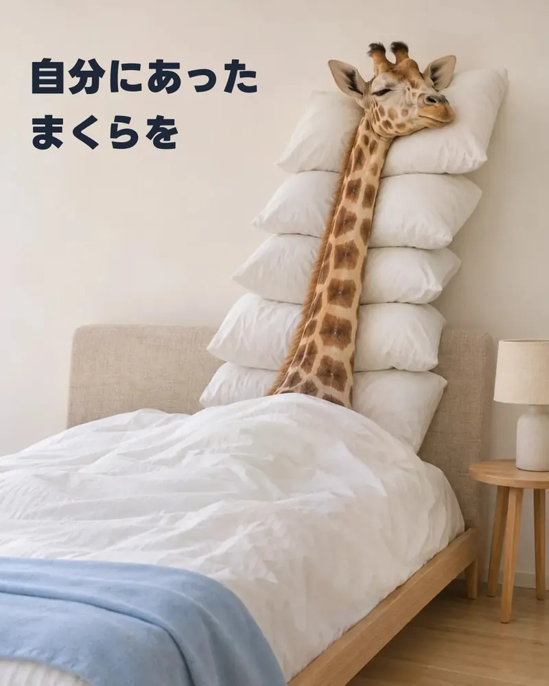
An unnumbered band placed just before the night section. A photo of a giraffe asleep with its long neck resting on a stack of pillows carries the line “Find the pillow that fits you” in Japanese. The wall behind is light, so there is no dark gradient and the text stays ink. Like blocks 03 and 15, the frame height is fixed at 1350. It is named 09.5 so it sits between blocks 09 and 10 on the board.
-
10Night section: how many apply?
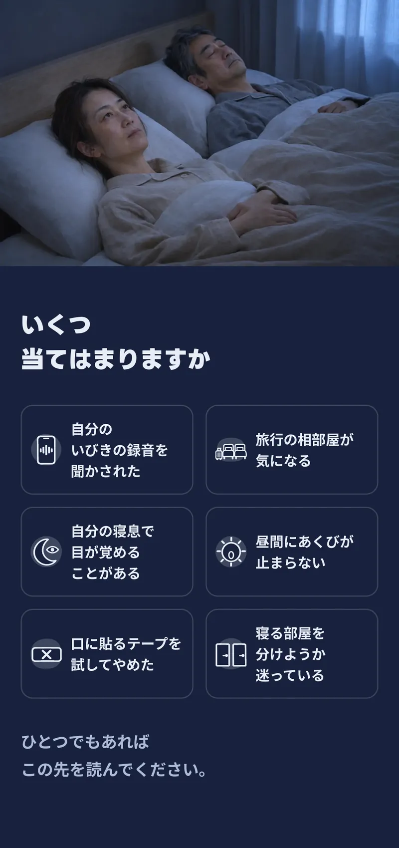
The night section starts here and runs for three blocks on the night background. Below a photo spanning the full board width (720 high), six checklist boxes sit in two columns, with each row's heights equalised.
The borders are night-ink at 18%, so the white lines stay soft. The icons are the landing page's SVGs at 88px, with lines bound to night-ink and shadows to night-ink at 18%. The labels break where the page wraps them, and the boxes use xs side padding so eight characters still fit on a line.
-
11To you, worried about snoring
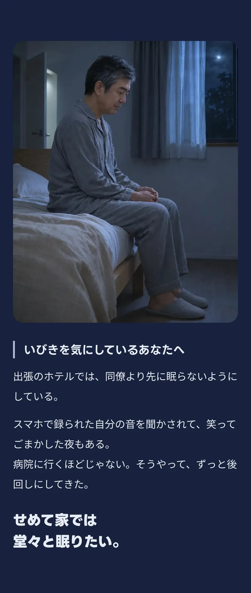
Blocks 11 and 12 are built by the same function in the plugin: a photo (1210 high) on the night background, an H3 with an 8px rule on its left (night-sub), body text and a closing subheading.
-
12To the family listening nearby
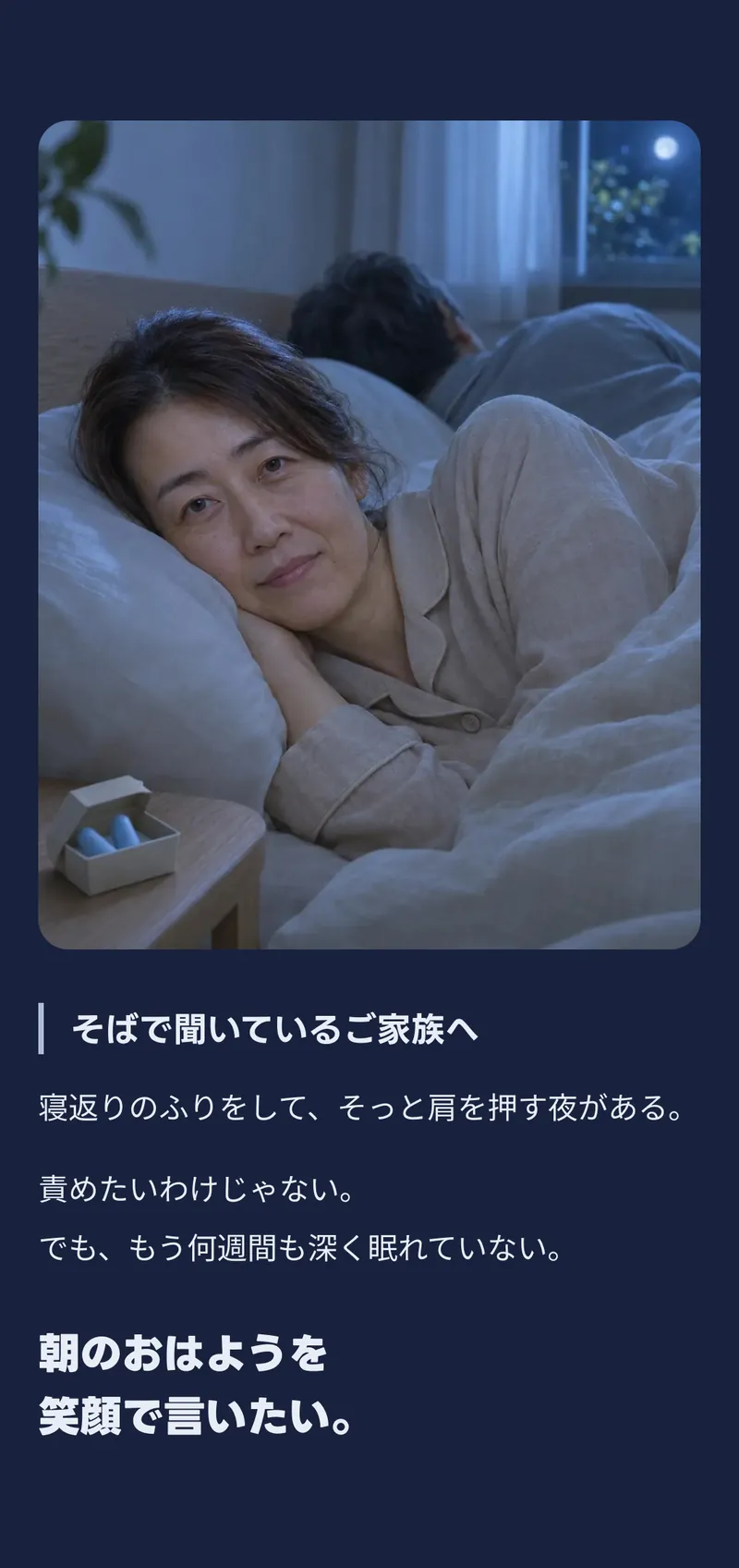
The same build as 11, filled with text from the family's side, so the two stories line up in the same form.
-
13Told about snoring
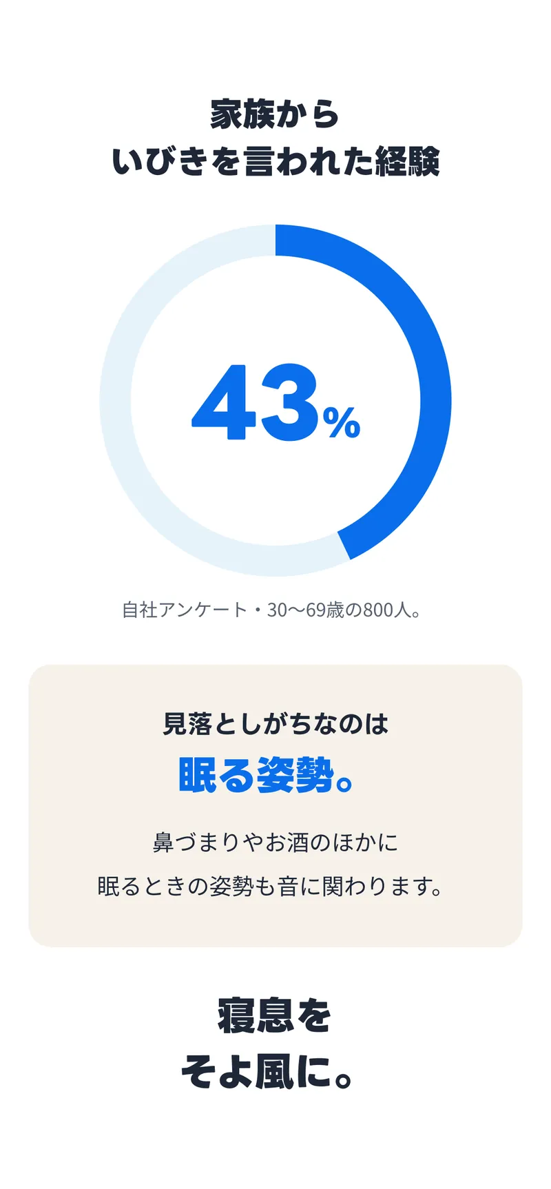
The donut chart uses an ellipse's arcData to draw a 43% arc over a sky ring. 43 uses the extra-large numeral style and % the medium. In the box below, the H3 mixes in the display heading style and accent for its last phrase, about sleeping posture.
-
14The maker
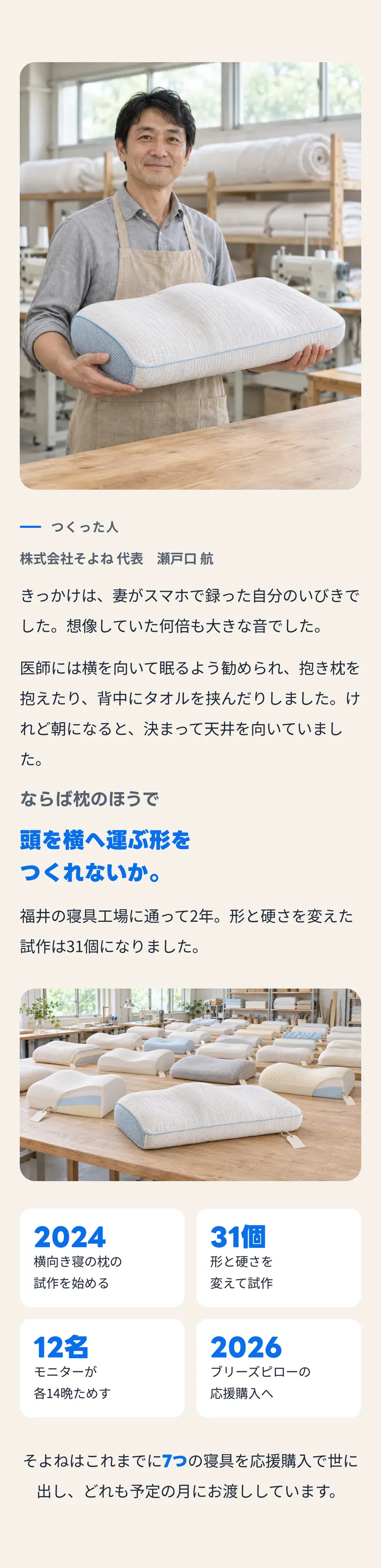
On the panel background, the maker's photo (1210 high) is followed by the eyebrow component, a name, body text, an H3 in ink-2 with an accent subheading, a photo of prototypes and four timeline cards.
The years and counts on the cards use the medium numeral style in accent, and each two-card row has equalised heights. In the final sentence, the number seven uses the small numeral style mid-sentence.
-
15Without a tap on the shoulder
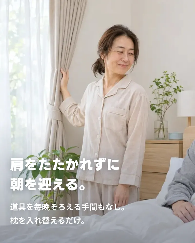
The same text-over-photo pattern as 03, but the text is pushed to the bottom of the frame and the gradient runs upward. The frame is 1350 high.
-
16Roll & Stay structure
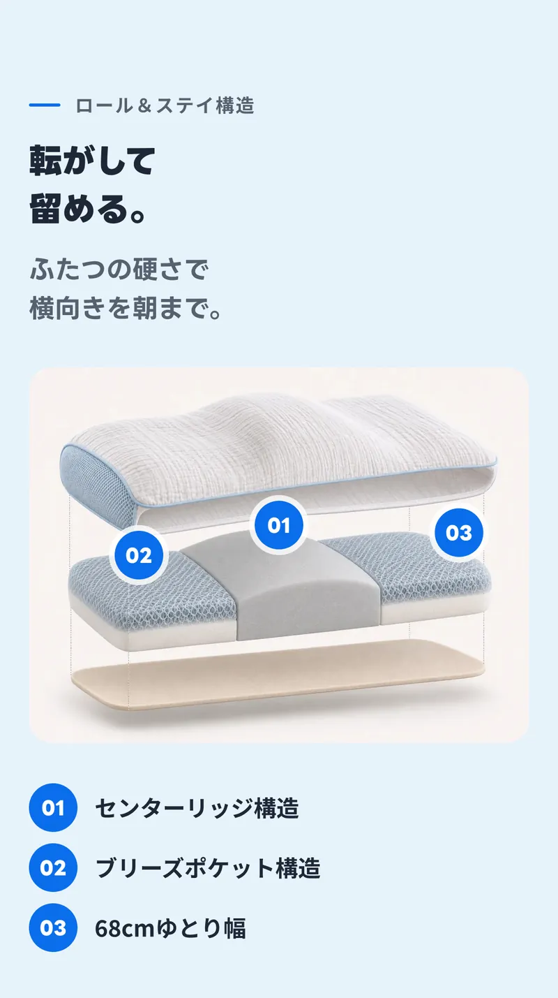
On the sky background, the numbers over the exploded-view photo (726 high) are instances of the numbered pin component. Only the pins over the photo get an outside white border (paper at 80%, 11px). The list below uses the same pins.
-
17Three structures
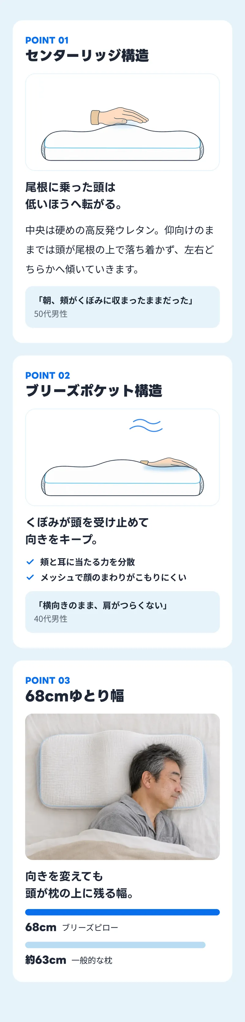
On the three cards (paper, radius m), the POINT 01 label uses the tag numeral style in accent. The press and sink animations from the page are drawn in their final pose inside a sky stroke.
The cards hold small monitor-comment boxes (sky) and check icons, and the third card draws width bars for 68 cm and about 63 cm in proportion.
-
18Mornings still on your side
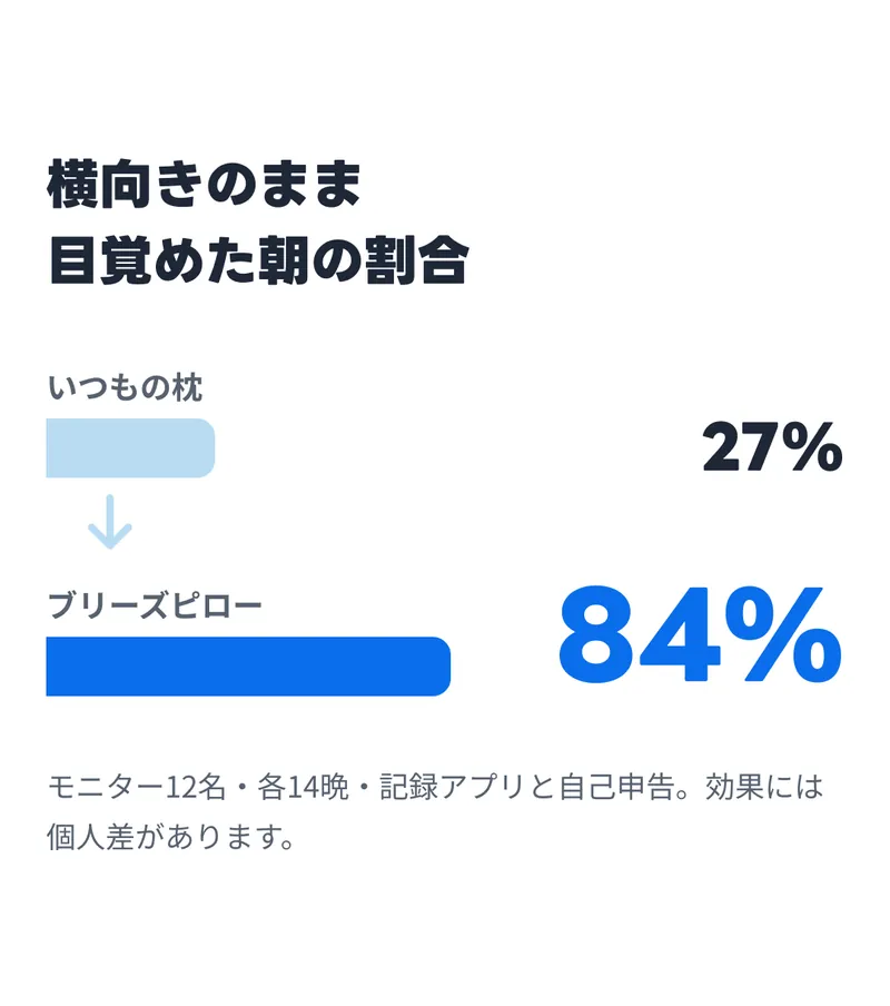
Each row stacks a name above a bar, with the figure on the right. Breeze Pillow's 84% uses the large numeral style in accent; the usual pillow's 27% uses medium. The downward arrow between them is an SVG in sky-2.
-
19In the shared bedroom
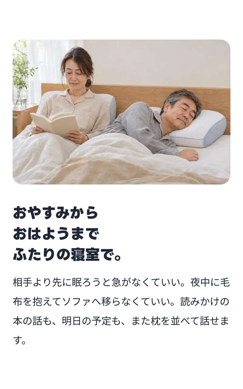
A block built from just three things: a photo (645 high), an H2 and body text.
-
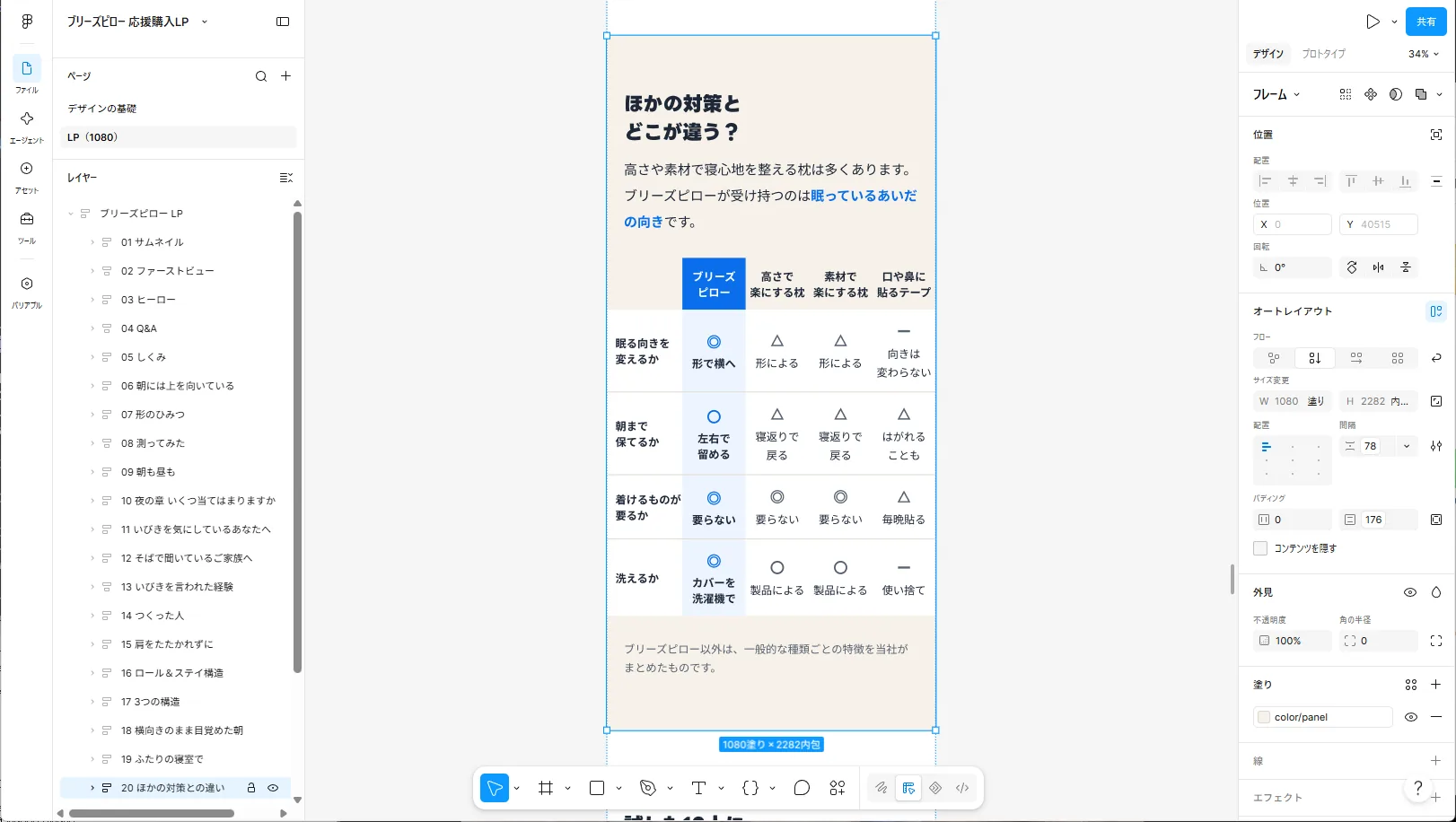
20Compared with other remedies
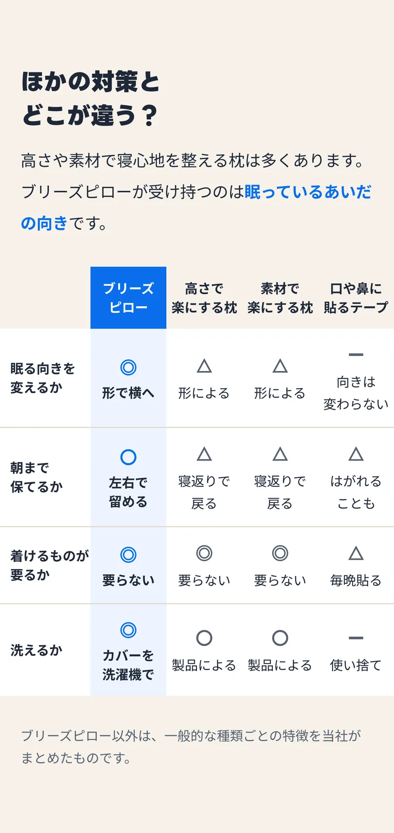
On mobile, the page's table scrolls sideways. The board cannot scroll, so only the table drops its side margins and runs to the board edges (column widths of 248 plus four of 208), fitting all five columns.
So that 36px text fits the columns, headers and cells break onto two lines at word boundaries. The Breeze Pillow column is filled with accent at 8%.
-
21Monitor comments
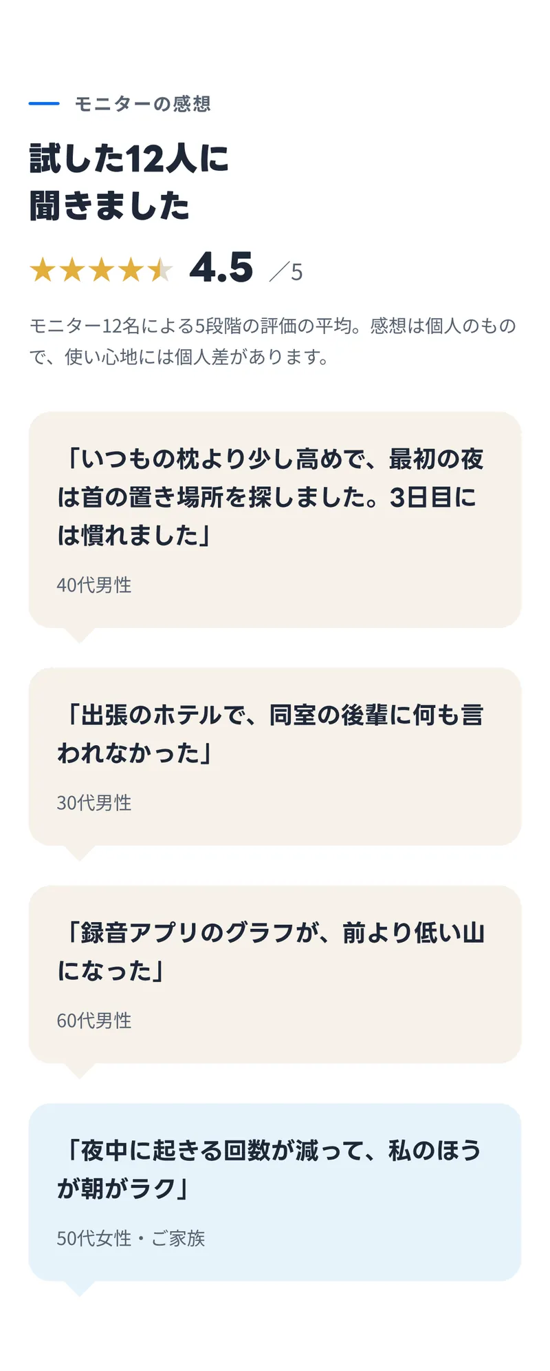
The fifth star is half gold: a gradient on that character range switches from gold to rule at 90%. The gradient spans the whole text frame, so the middle of the fifth star falls at 90%.
Two columns would break the page's sideways-scrolling comments into seven-character lines of 47px text, so the monitor comment components are stacked in one column. Only the family member's comment has a sky background.
-
22No consumables
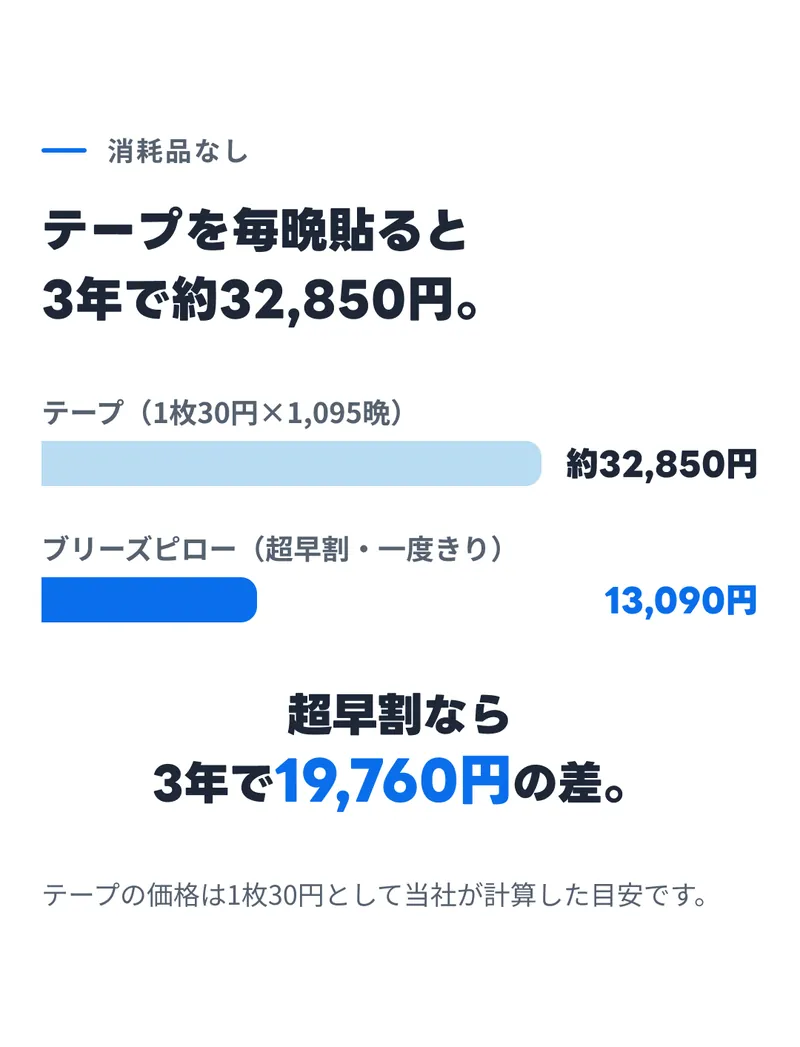
Three years of cost compare tape at 100 with Breeze Pillow at 40. The ¥19,760 difference uses the medium step of the five numeral styles, quieter than on the page, without adding a step.
-
23Rewards and guarantee
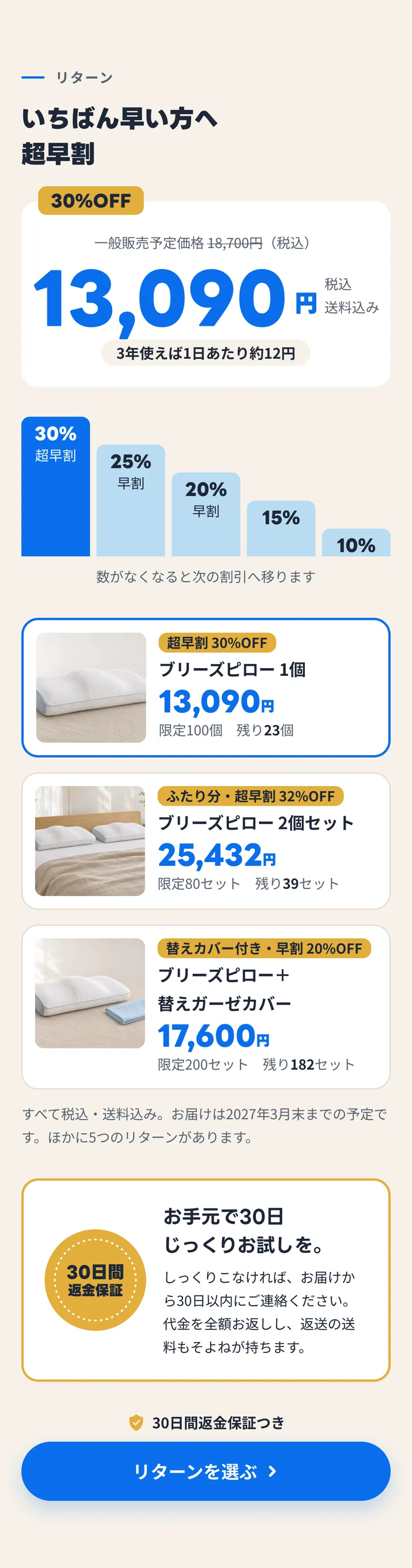
The discount tiers start at 366, the page's 132px times 2.77, and drop by 20% each, with only the top corners bound to the radius xs variable. The selected reward card has an accent stroke of 6; the others have a rule stroke of 3.
The money-back seal is a gold circle with a dotted circle (dashPattern) on top.
-
24Materials, specs and questions
In the spec table, the label column is set to 200 so the longest value, 19 characters, fits on one line. The FAQ, which opens and closes on the page, shows the first two questions open and the rest closed, with an upward chevron on open items and a downward one on closed items.

-
25Closing
Below the same text-over-photo pattern as 03 (1350 high) are an H2 and the button component with its money-back line. It is the same component as in 02, with only its label changed.