Web Apps / Mystery trading cards & random draws
Oripa Gacha
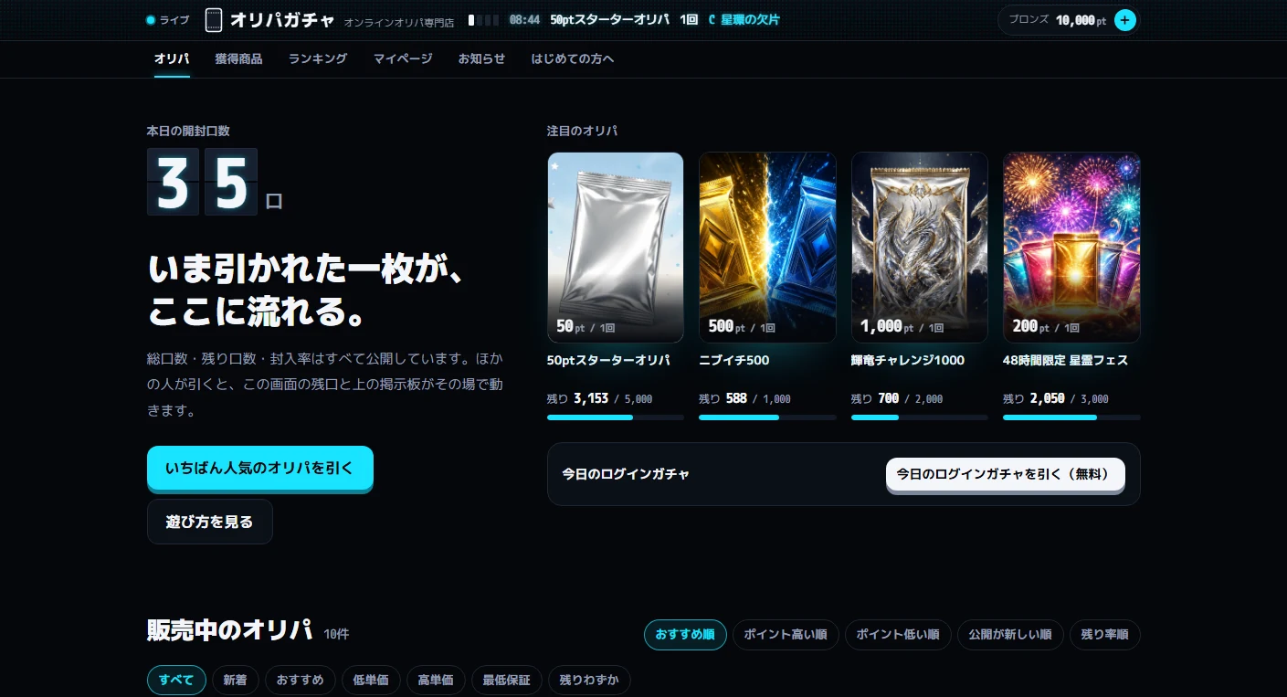
Someone draws a card.
It appears here, live.
An online service for mystery packs of trading cards (oripa), built around a fictional operator. Total and remaining entries and card odds are all visible. Other users' draws update the homepage ticker and card board immediately. Guests can try a draw, watch the opening animation and choose shipping or points.
View the live projectThis work is an original adaptation of a commissioned project. Payments and shipping are simulated; no real charges or shipments take place.
Show the numbers
before the draw.
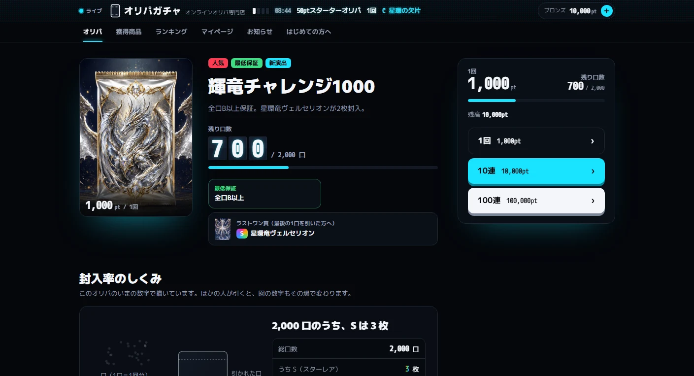
The central aim is to make clear which cards remain and how many. Pack details show the price, remaining entries, minimum guaranteed return, and card counts and odds by rarity before the draw button.
Starting as a guest gives visitors points to try the service without registering. Switching to the operator role lets them work with the same data in the admin interface.
Cool black.
Cyan light.
A cool black background uses cyan as its only glow color. Headings use Murecho, body text M PLUS 1p, and numbers and units the monospaced M PLUS 1 Code. Large figures emphasize prices, remaining entries and points returned.
Pack thumbnails and card art share a 5:7 format. Four border colors distinguish rarity: rainbow for S, gold for A, blue for B and white for C. The admin interface uses the same palette and typefaces, without the light bands or glow.
The draw result,
and what comes next.
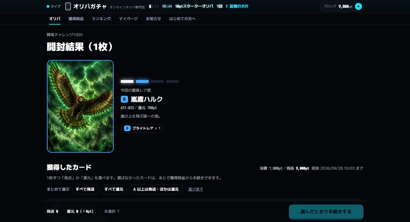
Visitors choose 1, 10 or 100 draws, review a confirmation dialog, then proceed to the opening animation. With WebGL, a three.js shader burns through the pack seal with a band of light. Unsupported environments and reduced-motion settings use a CSS-only 2D animation.
Results list cards by rarity. Each card can be shipped or exchanged for points. Cards left unprocessed for 30 minutes after acquisition are automatically exchanged for points. Both payment and shipping are simulated, with no real charges or shipments.
The display board
becomes two rows.
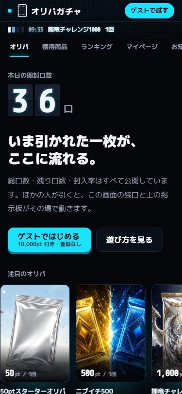
On mobile, the display band and ticker split into two rows, with the service name always visible in the band. There are no fixed bottom tabs. Category buttons sit in a single row below the band and scroll horizontally when space is limited.
Project details
- Version
- Not set
- Project type
- Fictional service
- Scope of work
- Planning, design, visual design & development
- Technologies
- TypeScript / React / Next.js
three.js / d3.js / SQLite - Supported screen sizes
- Desktop, tablet & mobile