Landing Pages / skin care / facial cleanser
SENILCA
Lather, wash gently, rinse.
A product page that follows one cleanse.
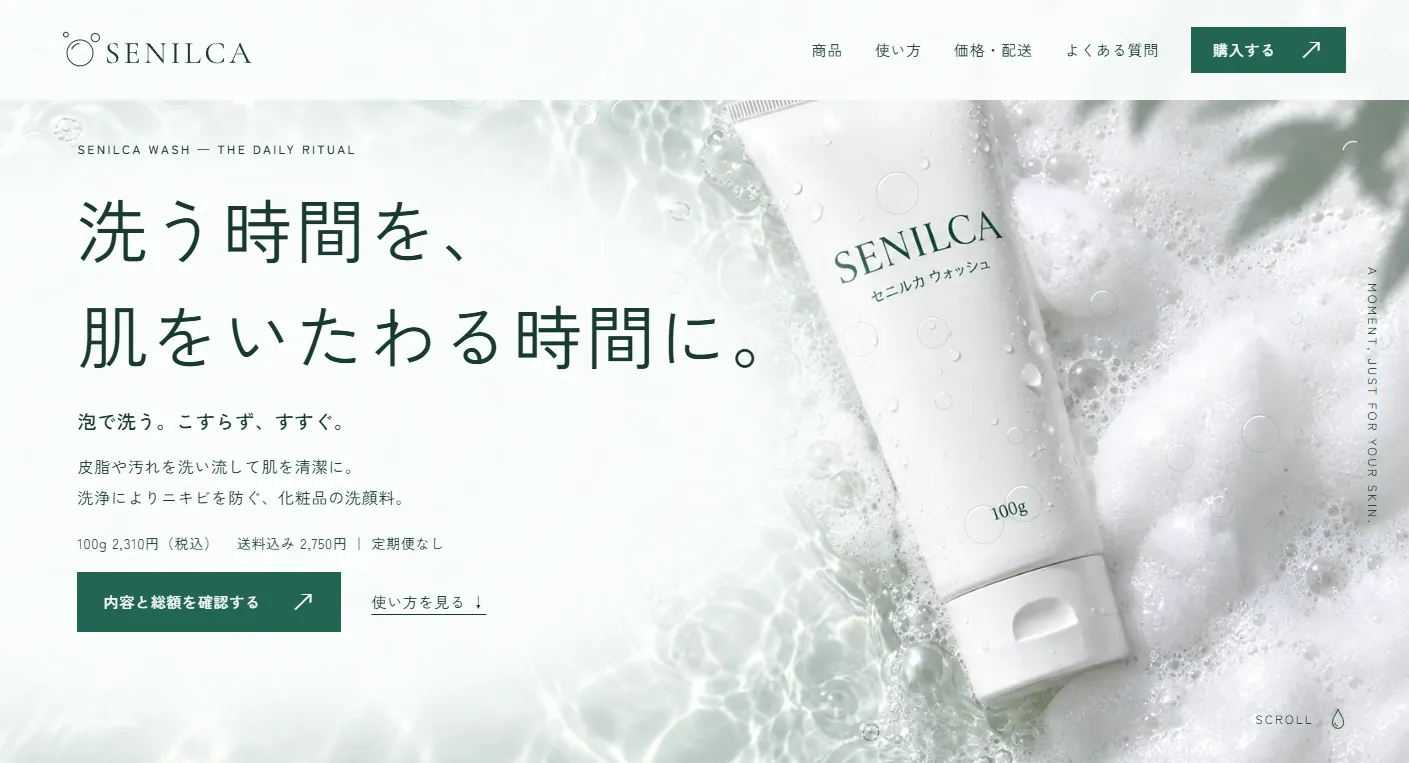
A single-page product landing page for SENILCA Wash, a facial cleanser for people concerned about acne. Scrolling follows the steps of lathering, washing and rinsing. Product specifications, instructions, the distinction from medical treatment, pricing, shipping and returns lead into quantity selection and checkout entry and review. All 12 photographic images were newly created with image generation.
View the live project (Japanese)This work is an original adaptation of a commissioned project.
Start with
how you wash.
The intended audience is people aged 20–35 who are concerned about acne or overwashing. For those who want to rethink their daily cleanse before adding more skin care, the page opens with three principles: build a full lather, avoid rubbing with fingers, and rinse thoroughly.
As this is a cosmetic cleanser, the page makes no promises of results and uses no results photos. A separate dark section states that the product does not treat existing acne, with guidance to stop use and seek medical advice if it does not suit the skin. The price is clear upfront: ¥2,310 plus ¥440 shipping, totaling ¥2,750 including tax, with no subscription.
From the first bubbles
to the final rinse.
The background moves from pale morning mint through foam white, rinse-water blue and deep-water green to a clean white finish. Japanese text uses Zen Kaku Gothic New; the brand name and numbers use Cormorant Garamond. A circular bubble motif appears in the logo, image reveals and progress indicators.
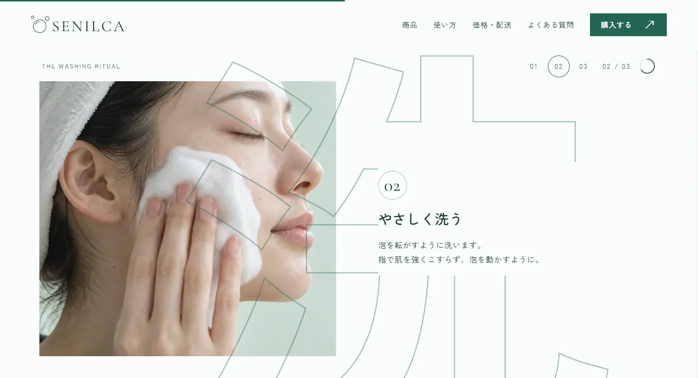
Canvas bubbles drift over a photograph of foam and water in the opening. After the product section, a small bubble expands to fill the screen, revealing a close-up of lather. In the instructions, large outlined Japanese characters meaning foam, wash and water move horizontally at different speeds from the hand photographs and step descriptions.
Check the total
and move to checkout.
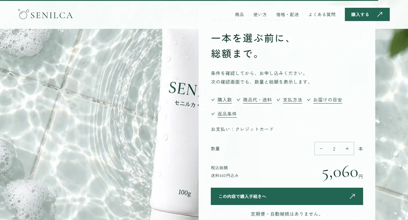
The pricing section presents the product price, shipping and total as a receipt, with numbers counting up to ¥2,750. An extending timeline shows dispatch and estimated arrival times. Three cards explain returns for a change of mind, incorrect or defective items, and products that do not suit the skin.
Selecting 1–5 bottles rolls each digit into the new tax-inclusive total. Checkout carries the quantity through entry, review, correction and completion. The horizontal instructions snap in the direction of scrolling, stopping at each step even with small movements. The form is a demo; it sends no data and processes no payments.
Keep the headline
and price in view.
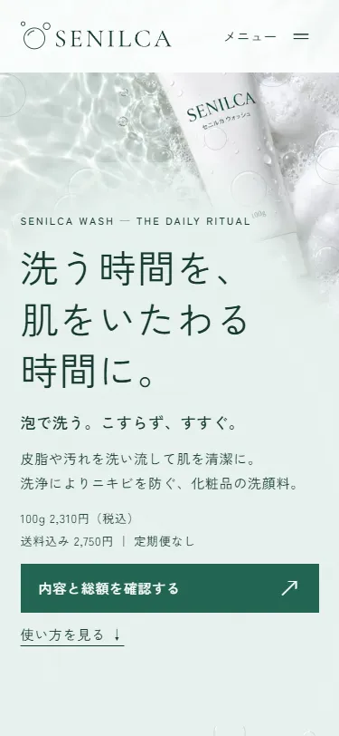
On mobile, pinned sections become three vertically stacked steps. Outlined characters sit behind the photographs, which reveal from a bubble-shaped circle. The opening fits the headline, price and purchase button below the product image. After it scrolls away, a bottom bar shows the total and purchase button. Reduced-motion settings disable the effects for a static reading experience.
Project details
- Version
- 1.0.0
- Project type
- Fictional website
- Scope of work
- Structure, copywriting, design & development
- Technologies
- HTML / CSS / JavaScript
GSAP / ScrollTrigger / Lenis / Canvas - Supported screen sizes
- Desktop, tablet & mobile